Hi.
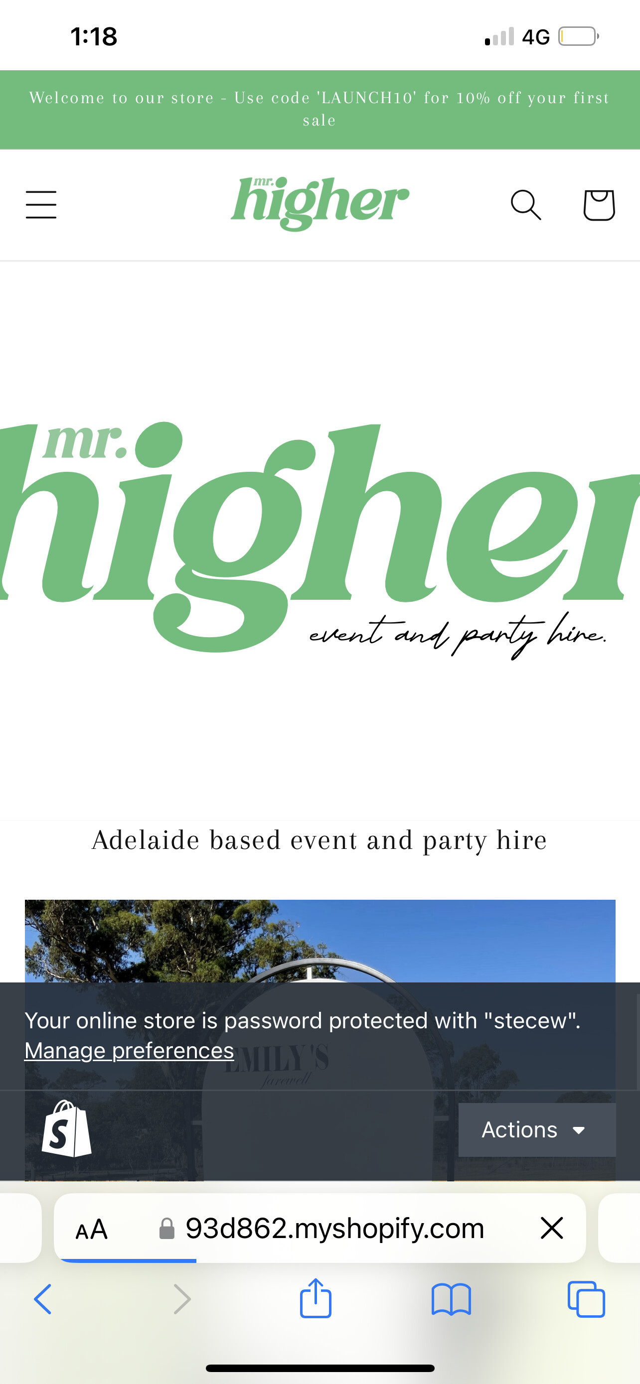
I have an image on my homepage which is displaying larger than the screen size (as pictured). It fits perfectly in desktop so only want to change the size on mobile. How can I do this please?
using dawn 2.0 theme. Site URL https://93d862.myshopify.com password stecew
Thanks in advance
Hi [email removed]Ryanxanthopoulo,
You can try this code by following these steps:
Step 1: Go to Online Store->Theme->Edit code.
Step 2: Search file section-image-banner.css
Step 3: Paste the below code at bottom of the file → Save
@media screen and (max-width: 749px){
.banner--medium:not(.banner--mobile-bottom):not(.banner--adapt) .banner__content {
    min-height: 19.5rem !important;
}
.banner__media.media img{
object-fit: contain !important;
}
}
Hope my solution works perfectly for you!
Best regards,
Victor | PageFly
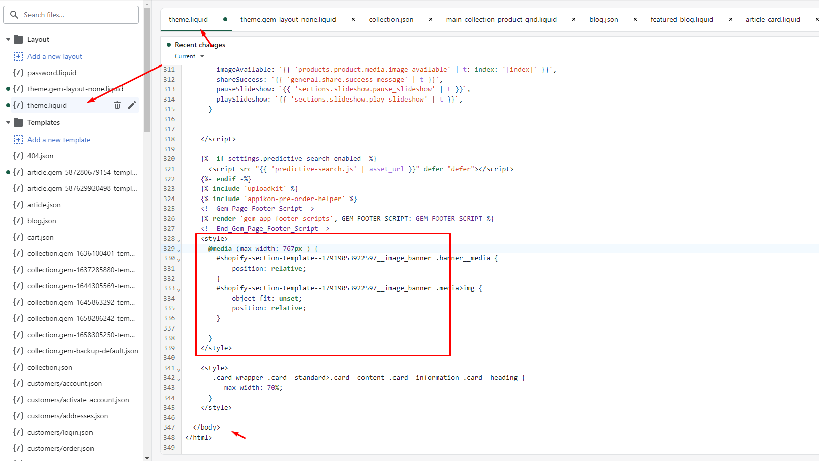
Hello @Ryanxanthopoulo ,
You can follow these steps:
- Go to Online Store->Theme->Edit code
- Open your theme.liquid file, paste the below code before
I hope the above is useful to you.
Kind & Best regards,
GemPages Support Team
Hi. This has worked, however now I can see this
You can try using another code
@media screen and (max-width: 749px){
.banner--medium:not(.banner--mobile-bottom):not(.banner--adapt) .banner__content {
    display:none !important
}
.banner__media.media img,.banner__media.media{
position:static !important
}

}
Thankyou this has fixed this!
You are welcome. I’m glad when I can help you