How can we add background color in these header icons, like this image below:

Hi @alexalex_225 , can you share your store url?
@Abdosamer check your inbox messages. I shared the URL
@alexalex_225 , go to base.css and add the following code :
svg.modal__toggle-open.icon.icon-search {
    margin: 0 !important;
}

svg.icon.icon-hamburger {
    margin: 0 !important;
}

 .header__icon .icon {

    margin-left: 1rem;
    background-color: green !important;
    border-radius: 5px;

}
@Abdosamer now looking like this in below image. I want the background color boxes to be equal in sizes

@alexalex_225 , Add this to base.css :
.header__icon .icon {

    height: 3rem !important;
}
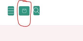
@Abdosamer Now looking like this above. I want the “search icon” and “hamburger/drawer icon” to look exactly like “cart icon” which has fair size and placed in the center of the color box. search and hamburger icon are quite big in size now and the color box is also not square around them.
Hello @alexalex_225
Can you share Store URL?
@niraj_patel kindly check your private message inbox. i shared url there
.header__icon .icon {
margin-left: 0.5rem;
background-color: #00404D !important;
border-radius: 5px;
height: 3rem !important;
width: 3rem;
}
I added this code to add color box around header icons. Kindly let me know how can i reduce the only icon sizes without reducing the color boxes, as you can see (below image) header icons are quite large in sizes as compared to the color boxes.

Hello @alexalex_225
You can add code by following these steps
-
Go to Online Store → Theme → Edit code.
-
Open your base.css file
-
Paste the below code at bottom
.header svg.icon.icon-hamburger {
padding: 9px !important;
}
.header svg.modal__toggle-open.icon.icon-search {
padding: 6px !important;
}
@niraj_patel Now in mobile view, header icons are not properly placed, (see image below). Kindly let me know how to align these header icons properly in Mobile view.

Hello @alexalex_225
Can we discuss in dm?
@niraj_patel sure, check your dm
Hello @alexalex_225
You can add code by following these steps
-
Go to Online Store → Theme → Edit code.
-
Open your base.css file
-
Paste the below code at bottom
@media screen and (max-width:767px){
.header .header__icons a#cart-icon-bubble {
position: absolute;
left: 75px;
padding-bottom: 0px !important;
}
}
@niraj_patel kindly check your inbox now
Hello @alexalex_225
You can add code by following these steps to align footer content in center in mobile view
-
Go to Online Store → Theme → Edit code.
-
Open your base.css file
-
Paste the below code at bottom
@media screen and (max-width:767px){
.footer .footer__blocks-wrapper.grid.grid–1-col.grid–2-col.grid–4-col-tablet.scroll-trigger.animate–slide-in {
display: flex;
justify-content: center;
align-items: center;
}
}