How do i Make the collection list look the same on the mobile app as it dose on desktop. looks bad on mobile. I want the collection list to fit in the whole window and I want the text on the photo like it is on desktop.
Topic summary
A user is troubleshooting mobile display issues with their collection list, which appears differently than the desktop version. The main problems include:
- Collection list not fitting properly in the mobile viewport
- Text overlaying photos incorrectly
- Excessive scrolling required on mobile
- Text size taking up too much space on images
Resolution:
The user progressively resolved most issues through the thread:
- Fixed initial layout problems
- Adjusted text sizing
- Resolved scrolling behavior
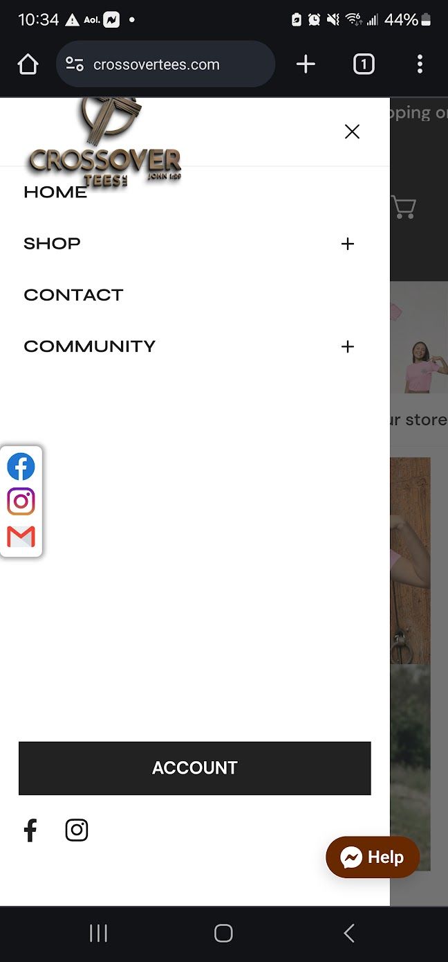
A final minor issue was raised with an accompanying screenshot, but the user ultimately thanked others, suggesting all problems were addressed. The discussion appears resolved with the mobile collection list now matching the desktop appearance.