I really dont like how the online store button looks. Can anyone help make some suggestions? I am having a hard time finding how to change the design.
Hey @bkerch
Follow these Steps:
- Go to Online Store
- Edit Code
- Find theme.liquid file
- Add the following code in the bottom of the file above </ body> tag
<style>
section#shopify-section-template--23606036431095__image_banner_mULWCz .button--secondary:after, section#shopify-section-template--23606036431095__image_banner_mULWCz .button:before {
    box-shadow: unset !important;
}
section#shopify-section-template--23606036431095__image_banner_mULWCz a.button.button--secondary {
    background: white !important;
    border-radius: 20px !important;
    border: solid 1px black !important;
}
</style>
RESULT:

If you require any other help, feel free to reach out to me. If I managed to help you then a Like would be truly appreciated.
Best,
Moeed
Can we make it just more transparent than flat white
Hi @bkerch
Are you a designer? No, then do next best thing, try to see what popular stores, or anyone, if your nishe is doing for a hero banner.
For example, your current transparent button, what is its purpose?
Call to action button that is, depending on screen size, almost invisible.
Why you want to have it transparent, so it does not ruin a good image?
Well, your purpose is to guide customers to the page you want, to be one more step to buying something. So, I think that button should be dominant and visible, to stick out, and that the customer can not miss it. So I tried this:
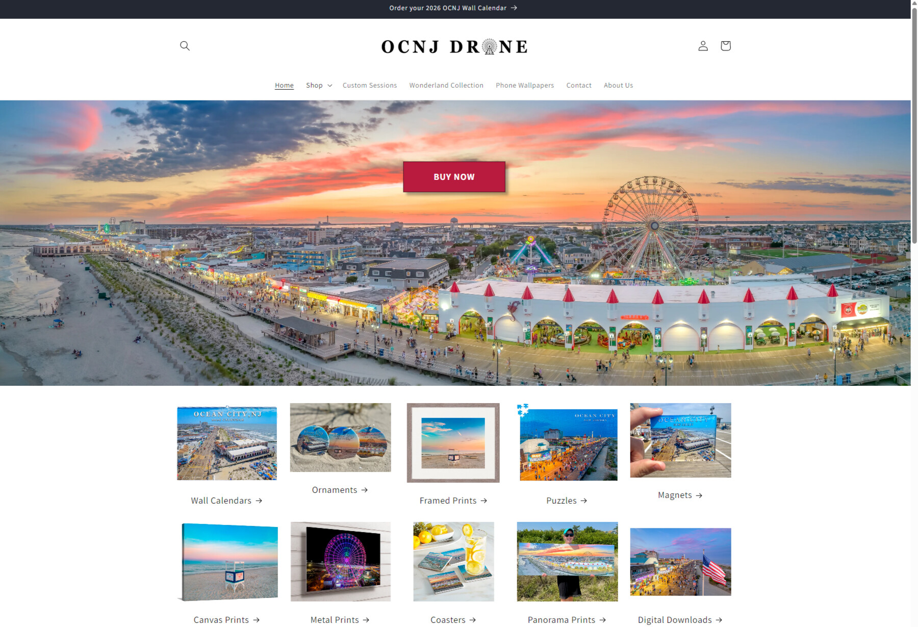
I took red from castle cones, so it has some connection to the image. Increased font a bit, made it uppercase and also changed the text. “Online store” is a bit confusing, what does that tell customers, “you are at an online store” or click here to go to the online store? And it could also be “Check our collections/products” also. You can try it in your image banner section, in the Custom CSS setting, so it would apply to just that one button. Add this code
.button {
  color: #fff !important;
  background-color: #b81b3e !important;
  text-transform: uppercase !important;
  font-weight: 700;
}

@media screen and (min-width: 750px) {
  .button {
      font-size: 1.8rem !important;
      min-width: 20rem !important;
      min-height: 6rem !important;
  }
}
Oh, I actually really like this. Are you able to send me the code if I wanted it to be a black box with white text?
First make sure in that buttons settings you haven’t assigned a color with transparency.
All the other buttons with black-text have white-backgrounds.
As for content you really should examine why your sending customers to an “online-store” when the are already there.
Try the /collections url, some themes it is configurable in the theme customizer.
1 Like
Similar code, just background-color line change
.button {
  color: #fff !important;
  background-color: #121212 !important;
  text-transform: uppercase !important;
  font-weight: 700;
}

@media screen and (min-width: 750px) {
  .button {
      font-size: 1.8rem !important;
      min-width: 20rem !important;
      min-height: 6rem !important;
  }
}
But @PaulNewton does have a point. You are sending the customer to a custom page that has collections you already have below the banner. And it is not even a collection but a page. Think of extra clicks and how some customers may be confused.
Well, I guess the reason I was doing that was because it’s not all of my products. I just highlight some of the top ones at the main page, but the entire store is behind that button.
Well, I think I had the button because I wanted it to take you to the full store. The products on the front page were just some of the popular ones.
Not about the button , specifically about /online-store being redundant, possibly double so on top of a /page.
Versus just pointing to /collections (this should be the “Collections list” template)
/online-store can make sense on an external site if embedding shopify for example.
Or if there is a retail contemporary.
Or your specifically targeting an older demographic this has been ab-tested on.
Its the type of thing that leads to a disjointed user experience and just ends up being yet another stone a merchant has to keep track of for their entire information architecture.
Good Luck.
Hi there!
If you want to make that “Online Store” button stand out more, you have two main approaches: adjust the theme settings or add custom CSS. Many modern themes let you set a primary/secondary button style in the theme editor under Colors or Buttons. Try changing the background colour and border radius there first.
If your theme doesn’t expose these options, you can override the button styling in CSS. Find the selector for the link (using your browser’s inspector) and add custom rules in a custom CSS file or at the bottom of theme.liquid. For example, this code makes a button more eye‑catching:
<style>
.header .site-nav__link.btn {
  background: #ffd700;
  color: #000;
  border-radius: 20px;
  padding: 12px 24px;
  font-weight: 600;
  box-shadow: 0 3px 6px rgba(0,0,0,0.2);
}
</style>
Replace .header .site-nav__link.btn with the actual class/ID used by your theme’s “Online Store” link. You can tweak the colours, padding, border and shadow to match your brand.
After saving, clear your theme cache and preview the store; the button should look much more prominent.