Hello everyone,
I’ve been trying to customize the Dawn theme to show the “Add to Cart” and “Choose Option” buttons on hover on the home page product grid. I’m struggling to get it right. If anyone has done this before, could you please help me out?
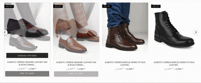
It would be really helpful if you can share the theme code changes with step-by-step instructions. If possible, please include screenshots – I’m attaching a reference GIF to show exactly what I’m looking for.
@theronak Short, practical fix you can apply now (works for Dawn variants) hides Shopify’s default card button and shows the Add to cart / Choose options on hover, with mobile fallback.
Steps (quick):
Backup your theme (Actions → Duplicate).
In Shopify admin go to Online Store → Customize → Theme settings → Custom CSS (easiest) — if your theme has no Custom CSS box, go to Online Store → Themes → Actions → Edit code → Assets → component-card.css (or component-product.css, base.css — paste at the end).
Paste the CSS below, Save, then test on desktop & mobile.
In the theme editor make sure Quick add / product card quick actions are enabled for your product grid (Homepage/Collection section settings) so the button exists in markup.
If buttons don’t appear in the right place, tweak the min-height and bottom values in the CSS.
CSS (copy-paste):
/* --- Hover reveal for Dawn product cards --- */
/* Paste in Theme settings → Custom CSS or at the end of assets/component-card.css */

.card, .product-card, .card-wrapper.product-card-wrapper {
  position: relative;
}

/* target common Dawn quick-add / card button containers (covers Dawn versions) */
.card__content .quick-add,
.quick-add,
.product-card__quick-add,
.card__buttons,
.product-card__actions,
.product-form--quick-add {
  transition: opacity .22s ease, transform .22s ease;
  opacity: 0;
  transform: translateY(8px);
  pointer-events: none;
}

/* show on hover or keyboard focus */
.card:hover .card__content .quick-add,
.card:hover .quick-add,
.card:hover .product-card__quick-add,
.card:hover .card__buttons,
.card:focus-within .card__content .quick-add,
.card:focus-within .quick-add,
.card:focus-within .card__buttons {
  opacity: 1;
  transform: translateY(0);
  pointer-events: auto;
}

/* place buttons as an overlay centered at the bottom of the card */
.card__content .quick-add,
.quick-add,
.product-card__quick-add,
.card__buttons {
  position: absolute;
  left: 50%;
  bottom: 14px;            /* adjust to move up/down */
  transform: translateX(-50%);
  display: flex;
  gap: .5rem;
  justify-content: center;
  z-index: 5;
}

/* make buttons visible by default on touch devices (no hover) */
@media (hover: none) {
  .card__content .quick-add,
  .quick-add,
  .product-card__quick-add,
  .card__buttons {
    opacity: 1 !important;
    transform: none !important;
    pointer-events: auto !important;
    position: relative;
    left: auto;
    bottom: auto;
  }
}

/* keep card info consistent so layout doesn't jump — adjust min-height as needed */
.card__information {
  min-height: 110px; /* change this to align buttons across cards */
  display: flex;
  flex-direction: column;
  justify-content: space-between;
}
Important tips
If your Dawn version uses slightly different class names, open a product card in DevTools (right-click → Inspect) and replace the selectors above with the actual classes you see (e.g. .card__primary-action / .quick-add__submit).
For precise vertical placement, change bottom: 14px and min-height until your grid matches the GIF.
Test keyboard/tab navigation (focus) — the snippet includes :focus-within so keyboard users can access buttons.