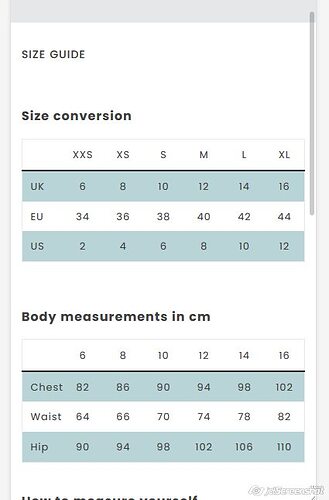
Hi, im not familiar to coding but would need to add a horizontal scroll to this size chart on mobile view as the chart doesn’t display fully on mobile. I’m not looking into chart builders as I want the chart to sit on a separate page instead of on every product page. Appreciate any help!
Topic summary
A user seeks to add horizontal scrolling to a size chart table on mobile devices, as the chart doesn’t display fully and they want it on a separate page rather than embedded in product pages.
Solution Provided:
- Navigate to Online Store → Theme → Edit code
- Open theme.scss.liquid file
- Add CSS media query targeting tables within specific sections
- Code uses
overflow-x: autoanddisplay: blockfor mobile viewports (max-width: 900px)
Additional Use Cases:
- Disabling table scroll on product pages (Debut theme): Target
.product__single-description .rte tablewithwidth: auto !important - Multiple users report success with the solution
- Some users encounter issues when applying to blogs or different page types
Ongoing Questions:
- One user asks about making tables responsive for blog posts (code doesn’t work on blogs)
- Another requests guidance on creating tables with sticky headers that scroll horizontally
- Implementation varies depending on theme structure and specific page types
The discussion remains active with users seeking variations of the horizontal scroll solution for different contexts.
Hello @xandermm ,
If you want horizontal scroll then
- Go to Online Store->Theme->Edit code
- Asset->theme.scss.liquid->paste bellow code in bottom of file
@media only screen and (max-width: 900px) {
#shopify-section-pages .rte-content table {
	overflow-x: auto;
	display: block;
}
}
It will look like below screenshot
If you want to make table responsive
@media only screen and (max-width: 900px) {
#shopify-section-pages .rte-content table {
	table-layout: fixed;
}
}
It will looks like below screenshot
Hi @oscprofessional this works like a charm! Thanks so much for your help :))
Hi was trying to do the same thing with a table just have it scroll and not resize.
pasted that code into my theme.scss.liquid and nothing happens …
Hello sldeangelo68,
Please share your site url.
So that i can check and let you know the exact solution here.
Hi, I have included a sizing table on every product description on my page. When I go to the mobile view half of my sizing chart is cut off. I have to tilt my phone sideways to view the whole sizing chart. Is there any way I could add a horizontal scroll to my product page so people can scroll sideways to see a full sizing chart without tilting their phone? I will send a screenshot and link it to my product page.
Hi! I added the code but the chart still is compressed and looks horrible on mobile. Any thoughts?
@oscprofessional Hi again, How can we make an table responsive for blog posts? This code isn’t working on blogs. (Debut Theme)
Thanks in advance.
How do we disable the table scroll on a product page (debut theme)?
Tried the below but didn’t work.
@media only screen and (max-width: 900px) {
#shopify-section-pages .rte-content table {
	table-layout: fixed;
}
}
Thanks a lot.
Hello henz123,
- Go to Online Store->Theme->Edit code
- Asset->theme.scss.liquid->paste bellow code in bottom of file
only screen and (max-width: 749px){
.product-single__description.rte table {
    width: auto !important;
}
}
Note: Please make ‘m’ of the media small when you paste the code
This worked perfectly! Thank you soo much!
Hi, I’m west son. How can we get to know each other better?
Hello @oscprofessional ,
I would like to build a table with sticky headers (top and side) that scrolls horizontally.
Do you have any suggestion? I am using the Expanse theme from Archetypes.


