I use code to make the image show different on desktop and mobile first image is show on desktop, second image is show on mobile.
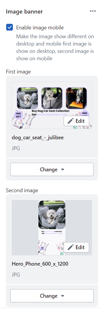
But, how to customize the #2 image’s height independently ?
Thanks a lot.
My store url: julibees.com
I use code to make the image show different on desktop and mobile first image is show on desktop, second image is show on mobile.
But, how to customize the #2 image’s height independently ?
Thanks a lot.
My store url: julibees.com
Hey @Shawn512
Follow these Steps:
If I managed to help you then, don’t forget to Like it and Mark it as Solution!
Best Regards,
Moeed
Thanks for your reply.
Can I use this code in the Theme Edit > Banner Image> Custom CSS
Hello @Shawn512
Refer this link: It will be helpful to you -
Yes of course! You can use this code in any CSS file.
If this helps you out then, don’t forget to Like it and Mark it as Solution!
Best Regards,
Moeed
.banner-image-separate-mobile .banner__media {
  @media screen and (max-width: 749px) {
this is the correct code btw.
Thanks a lot
 dont know why
It doesnt work
I put this code to the Custom CSS of the image banner:
.banner-image-separate-mobile .banner__media { @media screen and (max-width: 749px) {.banner--large:not(.banner--mobile-bottom):not(.banner--adapt) .banner__content{}
min-height: 110rem !important; }}
Hi @Shawn512 ,
This is Henry at PageFly - Shopify Advanced Page Builder app.
You can try this code by following these steps:
Go to Online store => themes => actions => edit code and add this code on file theme.liquid before tag
Hope this answer helps.
Best regards,
Henry | PageFly


