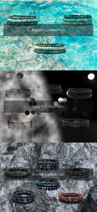
I added this code to center the image banner buttons, but on mobile it looks weirdly formatted. Any Suggestions?
.banner__buttons {
    gap: 45rem !important;
    max-width: none !important;
}
I added this code to center the image banner buttons, but on mobile it looks weirdly formatted. Any Suggestions?
.banner__buttons {
gap: 45rem !important;
max-width: none !important;
}
Hello @stonecold
Go to online store ----> themes ----> actions ----> edit code ----> assets ---->section-image-banner.css
add this code at the end of the file and save.
@media screen and (max-width: 749px) {
.banner__box>*:first-child {
margin-top: 60px !important;
}
.banner__buttons {
gap: 25rem !important;
}
}
result
If this was helpful, hit the like button and accept the solution.
Thanks
Hi @stonecold
You can use this code instead:
@media screen and (min-width: 769px){
.banner__buttons {
    gap: 45rem !important;
    max-width: none !important;
}
}
@media screen and (max-width: 768px){
.banner__content {
    height: 100% !important;
}
.banner__content .banner__box.content-container {
    height: 100% !important;
}
.banner__content .banner__box.content-container  .banner__buttons.banner__buttons--multiple {
    margin-block: 20% !important;
    gap: 24rem !important;
}
}
You can follow our instructions below:
Step 1: Shopify admin > Online store > Customize: https://prnt.sc/XQ6IDB99kUCd
Step 2: From the left menu > Theme settings > Open Custom CSS: https://prnt.sc/iDxwa8zBQ4Z-
Step 3: Copy the code above and paste it there
Please let me know if it works. Thank you!
Best,
Daisy - Avada Support Team.
Hi @stonecold ,
@media screen and (max-width: 749px) {
.banner__box>*:first-child {
margin-top: 60px !important;
}
.banner__buttons {
gap: 25rem !important;
}
}
If my reply is helpful, kindly click like and mark it as an accepted solution.
If you are happy with my help, you can help me buy a COFFEE
Thanks!