URL of page: https://handmediamonds.com/pages/rings
Problem: Trying to make this specific page full-width (i.e., 100%). I am using the Brooklyn theme.
My progress: I have tried the following code in timber.scss.liquid, theme.scss.liquid, and as a special page.liquid template that I made for this URL - none of the above worked alone or in conjunction with each other:
{% if page.url == '/pages/rings' %}
.wrapper {
  max-width: 100%!important;
  margin: 0!important;
  padding: 0!important;

  @include at-query ($min, $postSmall) {
    padding: 0!important;
  }
}
{% endif %}
I have also tried this:
{% if page.url == '/pages/rings' %}
.wrapper {
  max-width: 100%!important;
  margin: 0!important;
  padding: 0!important;
}
{% endif %}
… and this:
.wrapper {
  max-width: 100%!important;
  margin: 0!important;
  padding: 0!important;
}
I’ve also tried at least a dozen other variations from other threads, all of which did not work.
Others things I’ve tried:
- Inserting code at bottom of file(s).
- Inserting code at top of the file(s).
- Using to enclose the code when working in the page.liquid file.
- Inspect element of the affected page which indicates the padding is coming from timber.scss.css
- … and a variety of other things.
Tried solutions from members including @OTM , @Ahsan_ANC , and others.
Hi, @diamondlover123 thanks for trying some basic solutions.
I have just checked your page. it is already full-width.
Hi there, what ended up working for you? I’m faced with the same issue at the moment (also using Brooklyn theme).
Would appreciate your input!!
please share that page link.
Found this solution in another thread:
.wrapper { max-width: 100%; }
The content is already wider, but still not at full width (see screenshot)
You can try this code
- Go to Online Store-> Theme->Edit code
- Asset-> timber.scss.css ->paste the below code at the bottom of the file.
@media screen and (min-width: 591px){
.grid__item {
    padding-left: 0;
}
.wrapper {
    padding: 0;
}}
@media only screen and (min-width: 769px){
.push--large--one-twelfth {
    left: 0;
}
.large--five-sixths {
    width: 100%;
}
.large--four-fifths {
    width: 100%;
}
.push--large--one-tenth {
    left: 0;
}
.rte--indented-images img:not([style]), .rte--indented-images img[style="float: none;"]{
min-width: 100%;
}
}
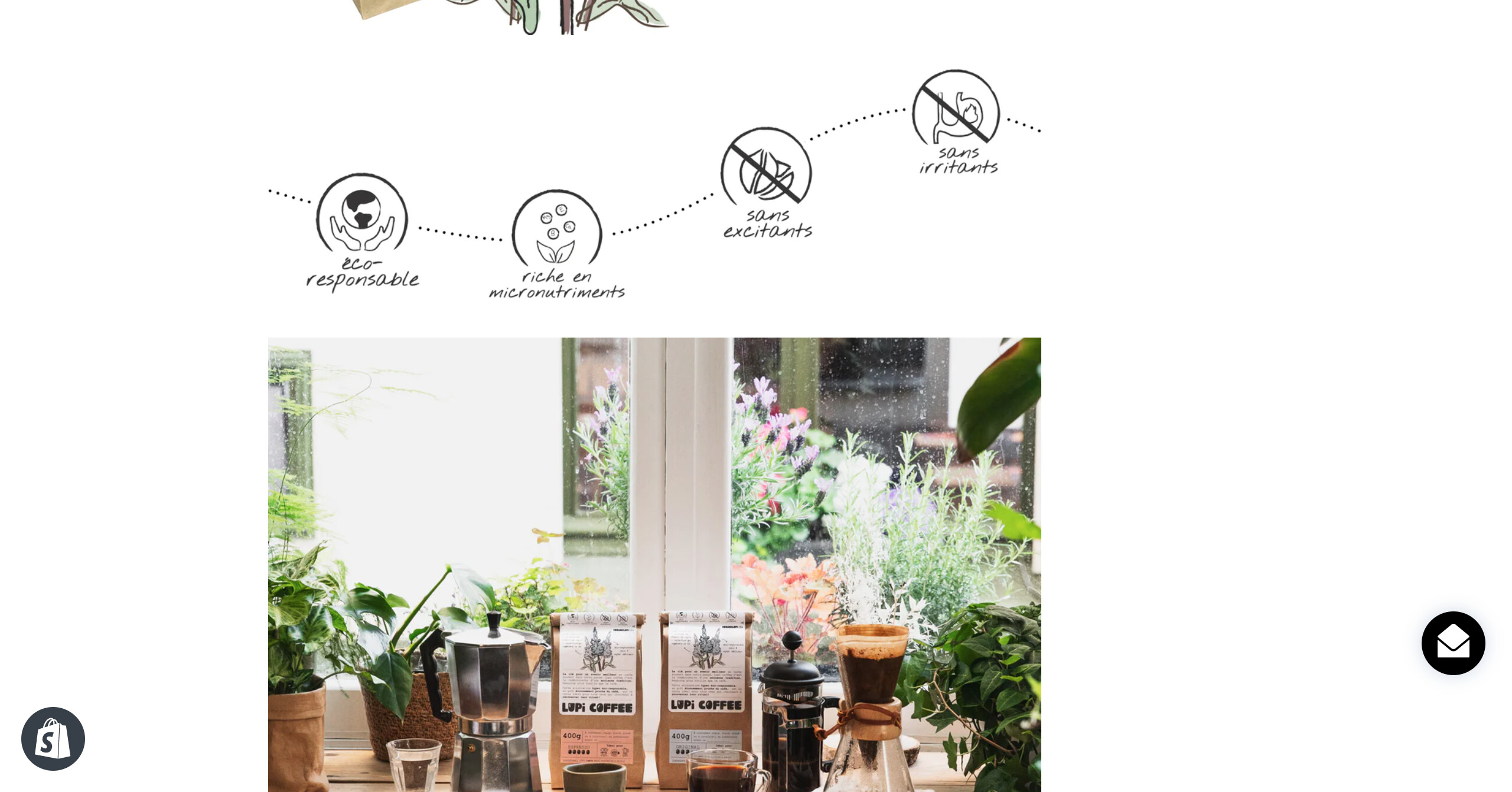
Thanks! It looks better now, but it’s still not at full width:
https://www.lupicoffee.com/pages/notre-cafe
Also, the margin is larger on the right, so that the content images are no longer centered. Do you know how to fix this?
try this
#notre-cafe .wrapper{
width:100% !important;
margin:0 !important;

}
#notre-cafe .grid__item{
  float:none !important;
}
.grid,.rte--indented-images img:not([style]), .rte--indented-images img[style="float: none;"]{
margin:0 !important;
}
That didn’t work either. The text is now at the standard width (so far from being full width) and the bottom navigation menu is now suddenly left bound.
Also, this new code snipped only applies to one sub-page, whereas the change should apply to all pages (except the home page).
Thoughts?
one solution is you can add me to your store so I can make changes and test them or remove all the changes previously done and let me generate new code for you.
That works! I suppose you send me a request to access our store, and I’ll approve? (this is my first time working with a shopify partner)
I just send the request with name Easy Knowledge
It’s accepted! Thanks in advance.
FYI I have removed all the code snippets that I had played with in the past days.
Hi, @lupicoffee completed.
1 Like
Great job, thanks a lot!
Can you share the solution here so that other’s can implement it too if needed?
Thanks again
Unfortunately, it will not work for other users the same way. Also, I am available here if some one else needs this for their store.
1 Like
Understood, thanks again for your help!
Hi again,
I uploaded the new content and now the image size is too large, so it larger than 100% now, and you have to scroll to the right to see the full image. Check out this page in desktop view (it’s the only one with the new content so far):
https://www.lupicoffee.com/pages/notre-cafe
Is there a way to adjust the width to 100% again? (as opposed to 120% or whatever at the moment)
The reason why this is happening is probably because the image size is slightly larger than what I had before to have higher image quality (the previous size looked pixelated at full width).
looking forward to hearing from you!