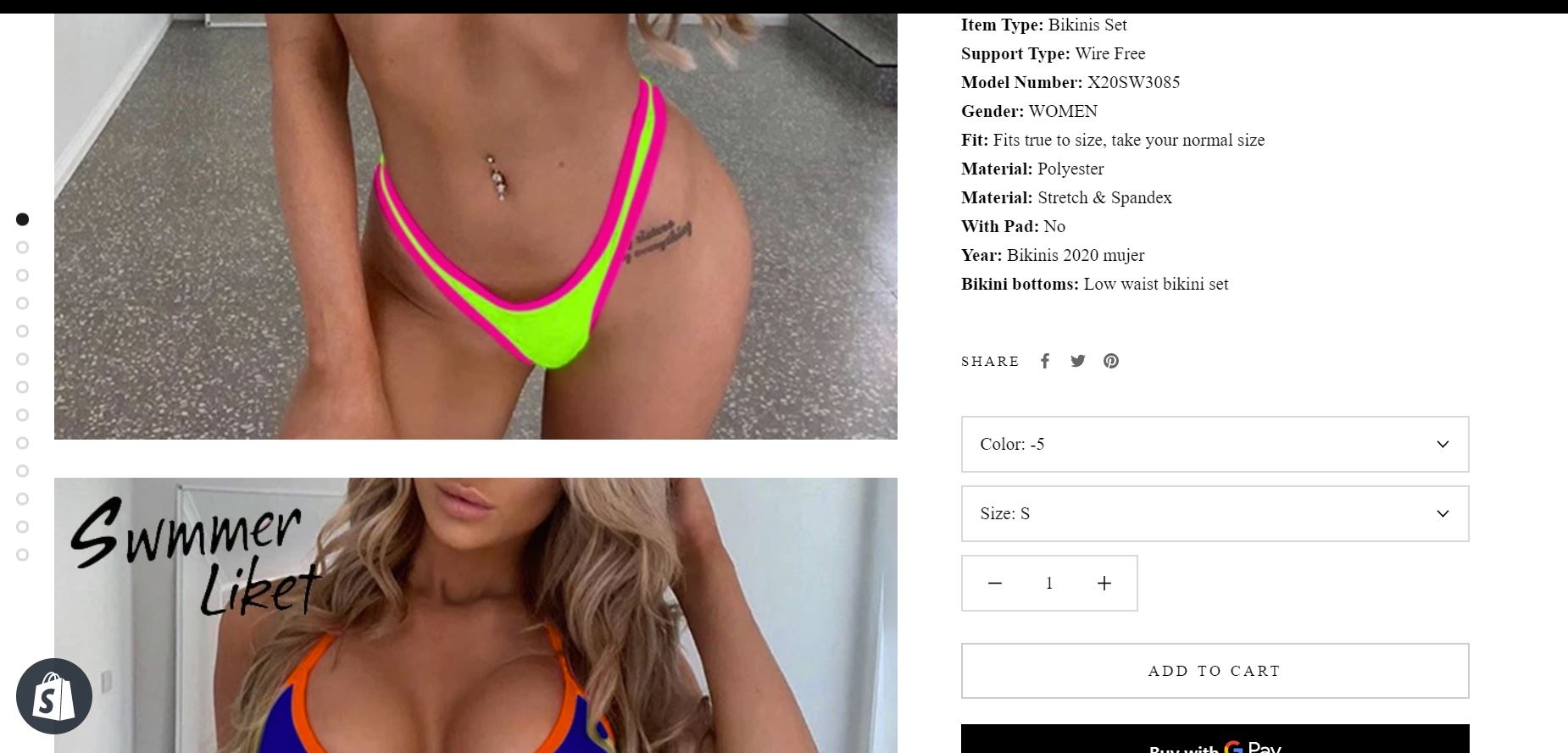
I would like my secondary and so on images to be displayed as small pictures below the large picture that the customer can click on to expand and replace the currently expanded picture as desired or if they can click to swipe horizontally that would be good too. I don’t like the pictures being displayed so far down the page all at one time and it jumping the customer around on the webpage when they select different variants in the dropdown. It’s also a headache when viewing the product page images to have to scroll up and down so much. My product pages currently have it such that every single image is fully expanded and they have to scroll down in order to view them all. On mobile, it displays the way I want it to. It’s only on desktop that I have this problem. I have attached screenshots. First one is desktop, second one is on mobile which is how I want it to be on desktop as well. Do I need to code in order to change this?

Hello, @Derelicte
Welcome to the Shopify community!
and Thanks for your Good question.
Please share your site URL,
So I will check and provide a solution here.
Any product page with multiple product pictures on desktop will show you what I mean.
Thanks!
do you like 2 product images per row right?
2 product images per row? Are you talking about the collections page on mobile? Yes I like that as 2 per row I currently have that as 2 per row. But my current issues is product pages on desktop. I like that to just display 1 large image but have the functionality of clicking horizontally like a carousel or having small pictures below the main picture and the user can click on any image to enlarge it
do you like the same product page 2 product image per row on mobile right?
This is how it is on mobile for me and how I like it. 1 product image per row on mobile product page. The reason you see 2 girls in bikinis (2 products) in my original post of how it looks on mobile is because when I screenshotted I swiped halfway to the next pic. Just to emphasize the ability of being able to swipe left and right. So on desktop I’d like it to be 1 product image that is full size at one time on the product page
if possible to provide video further issue
I’m having difficulty sending a video. Right now on desktop you have to scroll vertically to see all the product images. Instead I want it to be such that there is no scrolling involved. Where every other product image is displayed small below the main picture that is blown up. And if they want to see other pictures they can click on the small version and make that one blow up as the main picture.
ok do you need 1 main product image other thumbnail slider right?
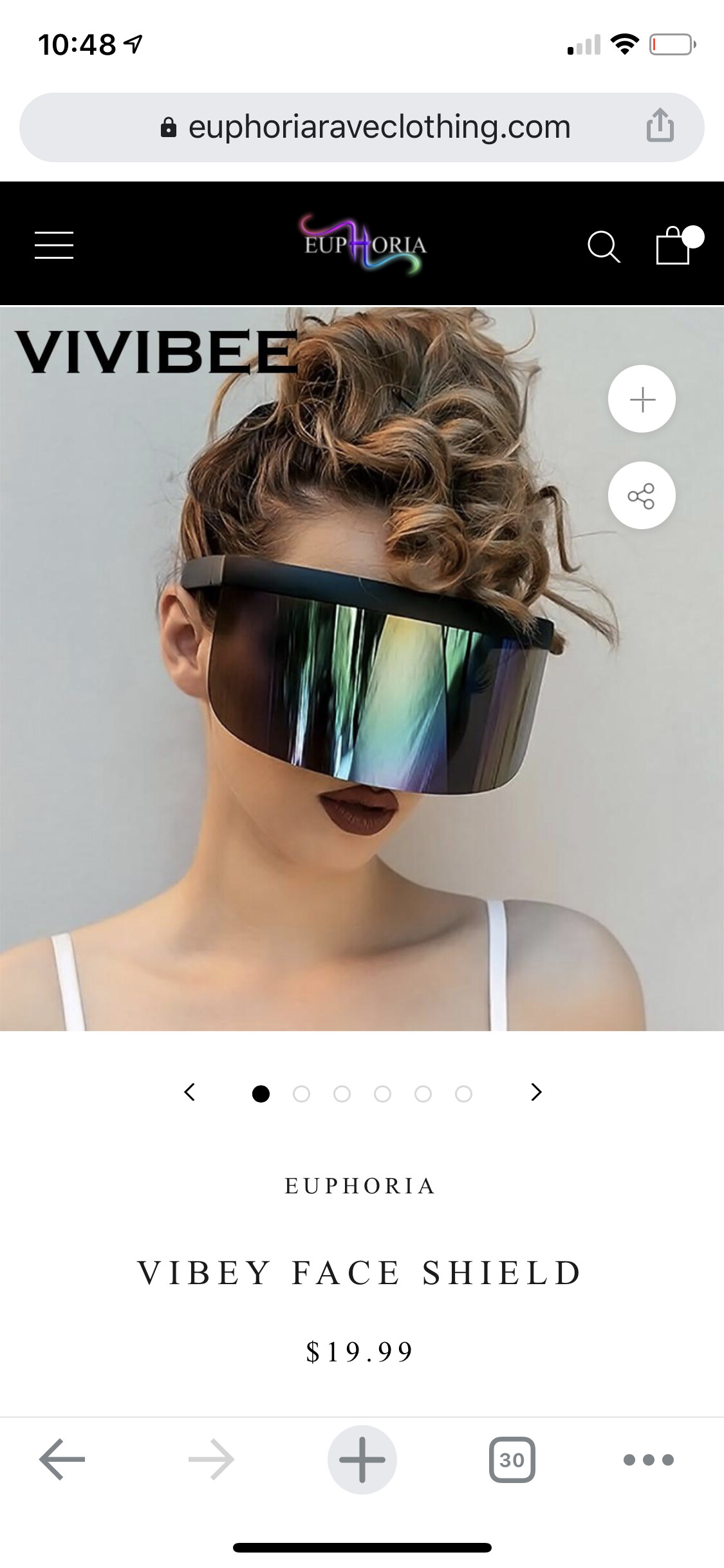
Yeah 1 main product image and then the ability to click on the desired alternate pic. So having all of the alternate pics displayed small below the main picture. Like this picture I attached. This store also uses the prestige theme so I know it’s possible.
Thanks for clarification
yes is possible.
It can be done by doing some code customization. Please take the help of a developer and hire Shopify Expert or me
Hi sorry I took so long to reply I’ve been busy. I will reach out to via message.
Thank you so much