Hi, anyone know how to make the display of my product photos remains portrait/vertical on both desktop and mobile? Now my product images are in portrait/vertical size on desktop but when I view them on mobile in my product page, the images are in square size. How do I make my images from square to vertical/portrait size on mobile?

1 Like
Hello @Crystalwclee Go to online store ----> themes ----> actions ----> edit code ---->assets ----> find ..
theme.scss.liquid or styles.scss.liquid open the file
add the code end of the file
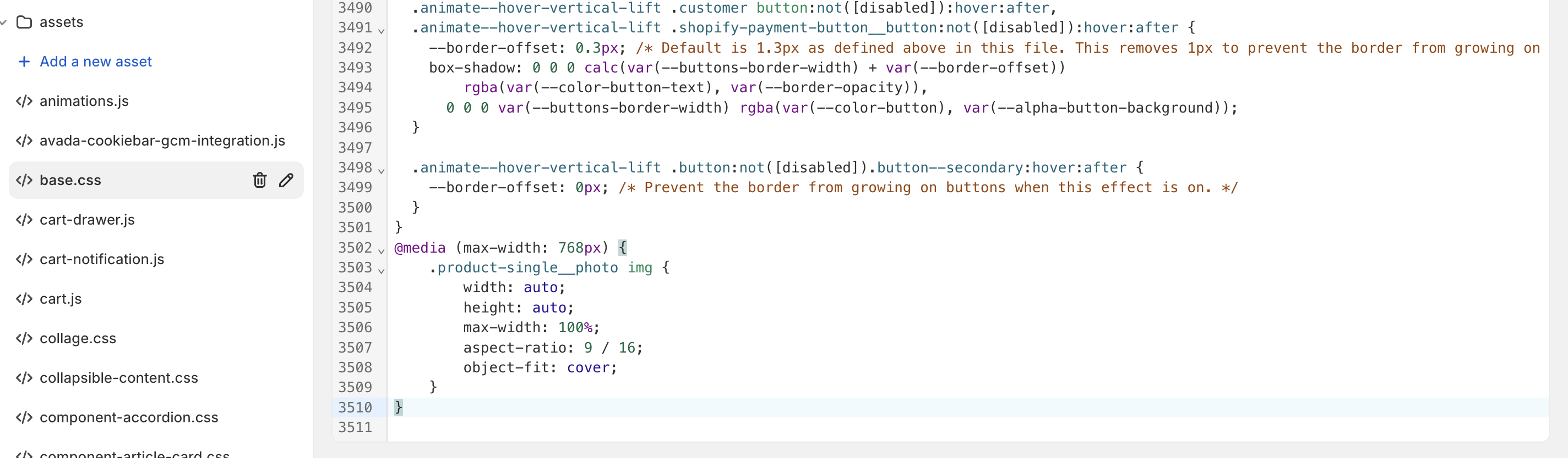
@media (max-width: 768px) {
    .product-single__photo img {
        width: auto;
        height: auto;
        max-width: 100%;
        aspect-ratio: 9 / 16;
        object-fit: cover;
    }
}
thankyou
hello, thanks for helping again 
Sorry but I couldn’t find the file theme.scss.liquid or styles.scss.liquid.

If you cannot find the files theme.scss.liquid, styles.scss.liquid, theme.css.liquid, or style.css.liquid, please add your code at the end of the base.css file. If it doesn’t work, send me the link to your website
thankyou


open the base .css and add this code into end of the file
@media (max-width: 768px) {
    .product-single__photo img {
        width: auto;
        height: auto;
        max-width: 100%;
        aspect-ratio: 9 / 16;
        object-fit: cover;
    }
}
thankyou

sorry let me do it
hi, the collaborator request code is 3865
plz send the store url 
Hi, is there any solution to this?
1 Like