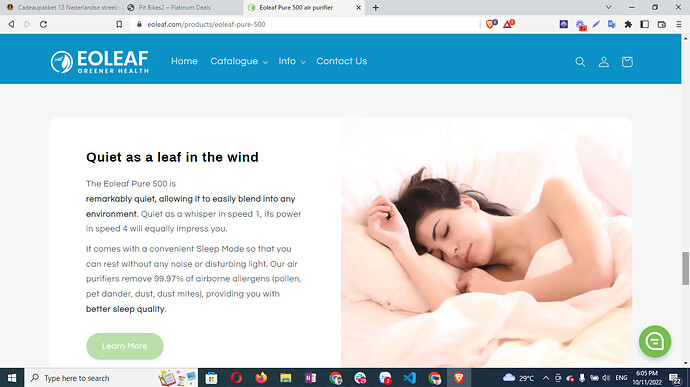
Hello,
Whenever I add an image and then a somewhat longer text to the “Image with text” section, the image gets badly distorted. Please see before/after pictures attached (along with store URL). How can I fix this? Ideally I would like the text to occupy half of the space, and the image to fit the other half. Right now it does that, except it zooms in the image very badly.
Hi,
Sharing your website link can be very relevant. Doing so would allow me and other community members to properly look into this.
Cheers!
Hey @GabrielS as mentioned in my post the URL is in the pictures I uploaded :). Thanks in advance for your help
Hi @Snow_Wolf - thanks for pointing that out!
I checked the website and I couldn’t find the section from your screenshot, can you share its link? All the links from homepage doesn’t seem to be set.
Cheers!
Hey @GabrielS , haven’t been able to find a solution, if you have any ideas what causes this, I would very much appreciate it!
Hi there,
One solution can be to use the following CSS code:
@media (min-width:768px) {
.image-with-text__media.image-with-text__media--adapt.gradient.color-background-2.global-media-settings.media {
padding-bottom:0px !important;
}
.image-with-text__media.image-with-text__media--adapt.gradient.color-background-2.global-media-settings.media img {
  position: relative !important;
  padding-top: 140px !important;
}
}
Adding the above code at the end of your base.css file should reflect the changes as in the below screenshot:
Cheers!
Thanks @GabrielS that’s certainly a start. I added that code in base.css but there’s still some formatting issues. For example section " Real-time air quality data" you can see that the image isn’t centered vertically (big white space above it, nothing beneath)
Unless someone else from this community can provide a better option- for further adjustments, I’d suggest to hire a web developer.
Cheers!
Thanks GabrielS. Maybe @Dan-From-Ryviu , @PageFly-Victor or @valiermedia can help as they have helped me before on other topics. Thanks in advance!!
Hi @Snow_Wolf ,
This is PageFly - Free Landing Page Builder.
To do it, you can go to Online store => themes => actions => edit code and add this code on file base.css
@media (min-width:768px) {
.image-with-text__media.image-with-text__media–adapt.gradient.color-background-2.global-media-settings.media {
padding-bottom:0px !important;
}
.image-with-text__media.image-with-text__media–adapt.gradient.color-background-2.global-media-settings.media img {
position: relative !important;
padding-top: 180px !important;
}
}
Or you can change “180px” to other numbers that you want to increase on your own.
Hope it helps!
PageFly
This is PageFly - Advanced Page Builder. If the below code doesn’t work well, you can try another code here:
- Go to Online Store->Theme->Edit code
- Asset-> base.css paste the below code at the bottom of the file.
#shopify-section-template–16419695558890__image-with-text-0 .image-with-text__media.image-with-text__media–adapt.gradient.color-background-2.global-media-settings.media{
display: grid !important;
}
#shopify-section-template–16419695558890__image-with-text-0 .image-with-text__media.image-with-text__media–adapt.gradient.color-background-2.global-media-settings.media img{
padding-top:0 !important
}
Hope my solution works perfectly for you!
Best Regards;
PageFly
@PageFly-Victor Thanks for your reply. This did not work, it’s not helping the images to be more aligned. The pictures are still uncentered
you can try to replace the old code
#shopify-section-template–16419695558890__image-with-text-0 .image-with-text__media.image-with-text__media–adapt.gradient.color-background-2.global-media-settings.media,#shopify-section-template–16419695558890__16648261177425438f .image-with-text__media.image-with-text__media–adapt.gradient.color-background-2.global-media-settings.media{
display: grid !important;
}
#shopify-section-template–16419695558890__image-with-text-0 .image-with-text__media.image-with-text__media–adapt.gradient.color-background-2.global-media-settings.media img,#shopify-section-template–16419695558890__16648261177425438f .image-with-text__media.image-with-text__media–adapt.gradient.color-background-2.global-media-settings.media img{
padding-top:0 !important
}
Hey @PageFly-Victor definitely making some progress! This only affected that one picture in the screenshot though, I’d like this change to be the case for all images part of a “Image with Text” section on this page.
Also, any way to add padding on top, right and bottom rather than full blown picture?
It already looks much, much better, thank you for your help!
Hi @PageFly-Victor just trying my luck and see if you have ideas to get me over the finish line on this :), thanks!
Do you want all the sections on this page to be aligned the same?
Hi @PageFly-Victor ,
Yes exactly, I need to:
- Have the same alignment for all “Image with text” sections"
- Adjust your code to add padding on top, right and bottom rather than have full blown picture
Thank you!!
sorry reply late. you can add my code
.image-with-text .image-with-text__media{
display: grid !important;
}
@media(min-width:1024px) {
.image-with-text .image-with-text__media.image-with-text__media–adapt.gradient.color-background-2.global-media-settings.media img{
padding:73px 73px 73px 0 !important
}
}
@media(max-width:1024px) {
.image-with-text .image-with-text__media.image-with-text__media–adapt.gradient.color-background-2.global-media-settings.media img{
padding:0px !important
}
}
@media(max-width:767px) {
.image-with-text .image-with-text__media.image-with-text__media–adapt.gradient.color-background-2.global-media-settings.media img{
padding:40px !important
}
}
Hey @PageFly-Victor thanks for your reply, much appreciated!
It’s certainly a start, many images look better already, but some don’t. Take this page: the images in the sections “Real-time air quality data” and “Quiet as a leaf in the wind” look perfect, as I would expect. But the images in the sections “Medical-grade air filtration” (very zoomed in), “Powerful air circulation” (no padding to the left), “Designed to make your life easier” (no padding to the left), and “Smart & connected” (zoomed in).
Appreciate your continued help on this!


