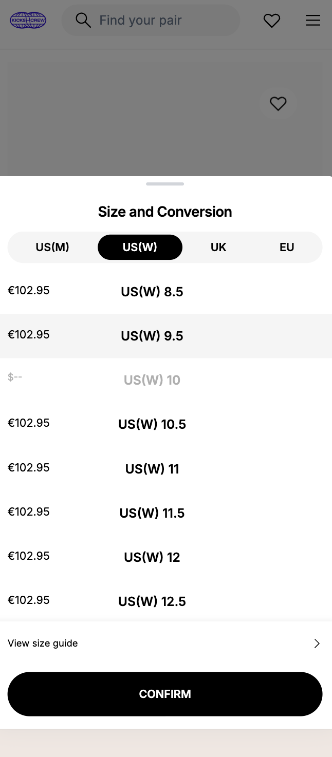
I’m looking to recreate a size selection feature similar to what I’ve seen on KICKS CREW — for example, this product page:
https://www.kickscrew.com/en-IE/products/rigorer-ar2-hbk-z324460101-7
Here’s what they’re doing:
-
The customer can select between US / UK / EU tabs (or dropdown),
-
Then choose their size under that specific format,
-
And add to cart directly from that region’s size selection.
It’s not a size chart it’s an actual interactive size picker that lets the user choose their sizing format and checkout.
Is this something that can be achieved with a Shopify app? Or would it need custom code?
Would love any suggestions on the best way to implement this on my store.
Thanks in advance!
1 Like
Hey everyone,
I’ve added a custom size selector on my product page using region-based buttons (UK, EU, US). Everything looks fine visually — sizes display correctly per region. However, the issue I’m facing is that when I select a size and click “Add to Cart”, nothing shows on the cart drawer.
Here are the codes I’m using:
main-product.liquid (HTML for buttons):
liquid
UK
EU
US
{% for variant in product.variants %}
{% assign title = variant.title | upcase %}
{% if title contains 'UK' %}
{{ title | remove: 'UK ' }}
{% elsif title contains 'EU' %}
{{ title | remove: 'EU ' }}
{% elsif title contains 'US' %}
{{ title | remove: 'US ' }}
{% endif %}
{% endfor %}
JavaScript for size and region switching:
html
CSS Styling (base.css):
css
.region-tabs {
display: flex;
justify-content: flex-end;
gap: 0rem;
margin-bottom: 1rem;
}
.region-tabs .tab {
width: 40px;
height: 30px;
border: 1px solid #000;
background: #fff;
font-size: 1.2rem;
font-weight: 500;
cursor: pointer;
display: flex;
align-items: center;
justify-content: center;
border-radius: 0px;
transition: all 0.2s ease;
}
.region-tabs .tab.active {
border: 1px solid #000;
background-color: #fff;
}
.sizes-grid {
display: flex;
flex-wrap: wrap;
margin: 0;
}
.size-btn {
width: 80px;
height: 50px;
font-size: 1.2rem;
font-weight: 500;
border: 1px solid #ccc;
background-color: #fff;
cursor: pointer;
display: flex;
align-items: center;
justify-content: center;
border-radius: 0px;
transition: all 0.2s ease;
margin: 0;
}
.size-btn.selected {
border: 1px solid #000;
}
.size-btn[disabled] {
opacity: 0.4;
cursor: not-allowed;
}
I think the issue has something to do with how the HTML and JavaScript are working together. If anyone has a fix or can suggest what I should change, I’d really appreciate it.