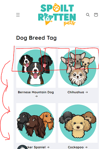
This is what our website currently looks like on mobile and the images seem massive. The only option we have for mobile view is one or two columns so If there is anyone who knows code who can help us show three categories within a list on mobile view ONLY it would be much appreciated. (Refresh Theme)
This is the desired outcome
1 Like
Hi @SpoiltRottenUK
Can I take a look? Would you mind to share your Store URL website? with password if its unpublish. Thanks!
Thanks for the info, check this one.
- From your Shopify admin dashboard, click on “Online Store” and then “Themes”.
- Find the theme that you want to edit and click on “Actions” and then “Edit code”.
- In the “Assets” folder, click on “base.css, style.css or theme.css” file, depending on which file your theme uses to store its CSS styles. At the bottom of the file, add the following CSS code:
@media only screen and (max-width: 989px){
.grid--2-col-tablet-down .grid__item {
    width: calc(33.33% - var(--grid-desktop-horizontal-spacing) * 3 / 4);
    max-width: calc(33.33% - var(--grid-desktop-horizontal-spacing) * 3 / 4);
  }
}
Please don’t forget to Like and Mark Solution to the post that helped you. Thanks!
Hi, is it at all possible for this to only happen on the collection lists and not the product lists on mobile.
Let me know thanks 
1 Like
Sorry Im confuse.
This is the collection list.
And the product list?
If im correct. On my screen its not showing it change. You can also this code so the column will show only on the section.
@media only screen and (max-width: 989px){
section#shopify-section-template--19607970939172__520ce44e-f2d6-4b45-91ba-f1c520d23b76 .grid--2-col-tablet-down .grid__item {
    width: calc(33.33% - var(--grid-desktop-horizontal-spacing) * 3 / 4);
    max-width: calc(33.33% - var(--grid-desktop-horizontal-spacing) * 3 / 4);
  }
}
And save.
Thanks!
Please don’t forget to Like and Mark Solution to the post that helped you. Thanks!
Hi this is great but was intending to have the xtra columns on all of the categories on the mobile view. The product categories now don’t have the xtra column thanks to your code here but now all of the other collections lists apart from the dog breeds are on two across again. Is this possible?
Thanks!
Because the issue with it being specific to that ONE collection list is that if we want to add more below it they are not the same amount of columns
as seen on our webpage https://www.spoiltrottenpets.com/collections/custom-dogs-motifs-tags on mobile view. Hope this makes sense. thank you for your help
Hi, this worked fine - but this displays 3 collections per row, what if i want to add more like 5. then can you please share code


