
The dimensions of this image are 5338x3559.
Topic summary
A user wants to increase the height of an image banner on mobile devices in the Dawn theme. Their current image (5338x3559 pixels) appears too short on mobile.
Two solutions were offered:
- Upload an image with greater height than width (though this may not display correctly on desktop)
- Add custom CSS code to the Image Banner section
CSS solution:
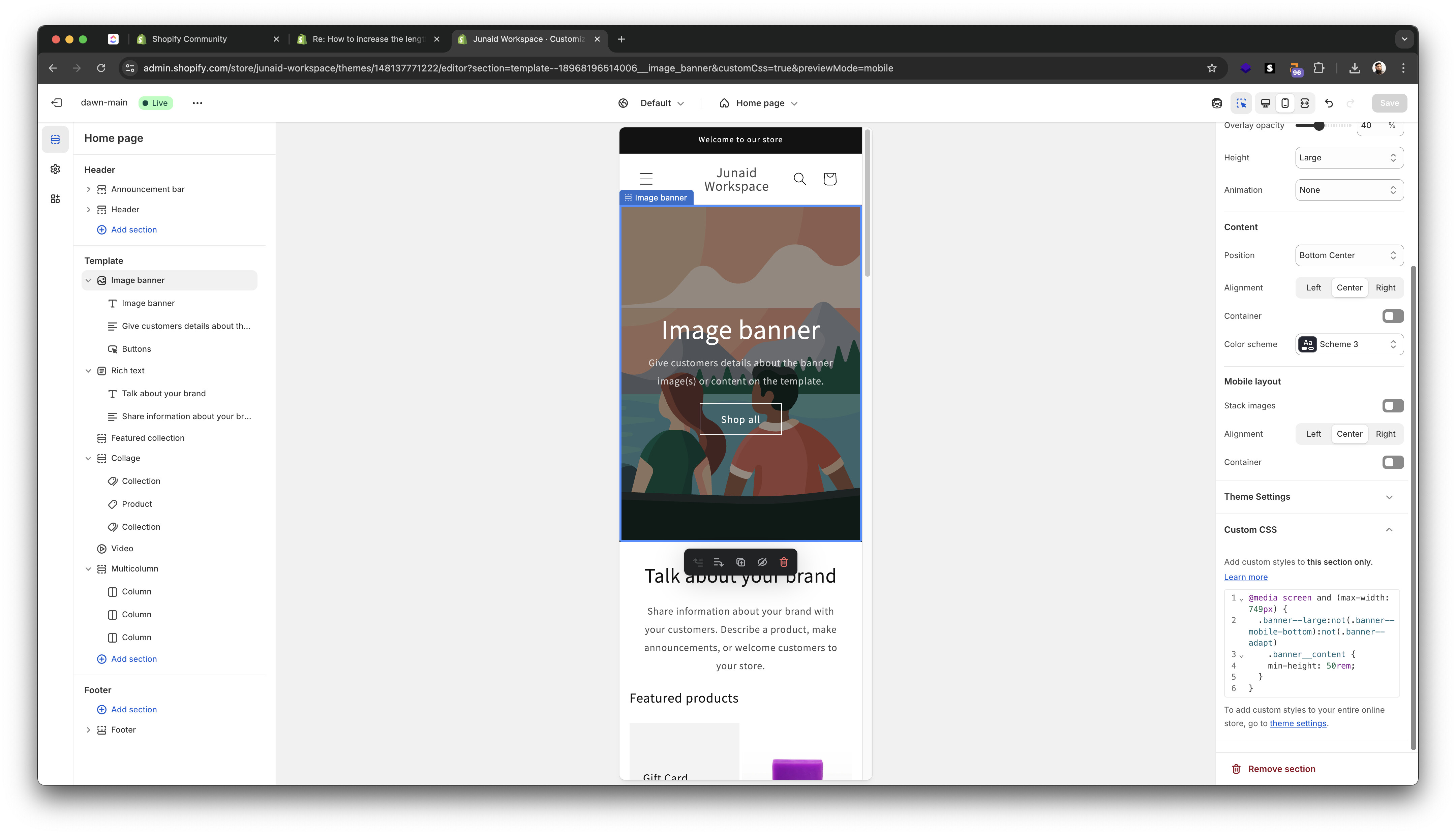
- Navigate to theme customizer → Image Banner section → Custom CSS
- Add media query targeting mobile screens (max-width: 749px)
- Adjust the
min-heightvalue (starting at 50rem, increase to 55rem or higher for more height)
Initial issue: The user first added the code to the Header section instead of the Image Banner section, causing errors.
Resolution: After placing the CSS in the correct section and adjusting the rem value, the solution worked successfully.
Hi Jim, you’ll probably need to upload an image with more height than its width. The thing is, this image will show correctly on the desktop version but not on mobile.
The other option is to achieve this with code. Here’s how you can do it:
-
Go to theme customizer.
-
Edit the image banner section.
-
Ad the end of the settings, you’ll see Custom CSS, add the following code in there.
@media screen and (max-width: 749px) {
    .banner--large:not(.banner--mobile-bottom):not(.banner--adapt) .banner__content {
        min-height: 50rem;
    }
}
- Increase or decrease the
50remto increase or decrease the height. This only affect the mobile version.
Here’s how it should look:

1 Like


It looks like you’re adding it in the Header section. Please add it in the Image banner section. Look at this screenshot:
1 Like
Ahmed I saw now the photo and where you are saying how it should look.. but exactly this I don’t want. it looks short. I want to be long like this photo of this theme bellow

It work out ! Thank you so much ! God bless you ! :))
Just increase the 50rem value, like 55rem and it’ll increase the height on mobile.