Hi everyone,
I hope you’re all doing well!
I am currently using the IMPACT theme for my Shopify store and I’m looking to set the product image ratio to be square. Specifically, I would like the main product image, as well as the images in the thumbnail buttons (carousel), to maintain a square aspect ratio.
Has anyone here managed to achieve this with the IMPACT theme? If so, could you please share the steps or any custom code you used to make this adjustment? Any tips or guidance would be greatly appreciated!
Thank you in advance for your help.
Hello @getshre .
Our team is ready to help you.
Please share your website address and access password (if necessary) so that we can check and assist you.
1 Like
- Here is the solution for you @getshre
- Please follow these steps:
- Then find the base.css file.
- Then add the following code at the end of the file and press ‘Save’ to save it.
@media screen and (min-width: 700px) {
 .product-gallery__media img {
    width: 750px !important;
    height: 750px !important;
}
.object-contain {
    object-fit: cover !important;
    width: 64px !important;
    height: 64px !important;
}
}
@media screen and (max-width: 700px) {
 .product-gallery__media img {
    width: 328px !important;
    height: 328px !important;
}
.object-contain {
    object-fit: cover !important;
    width: 56px !important;
    height: 56px !important;
}
}
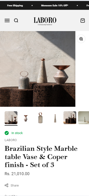
- Here is the result you will achieve:
- Please press ‘Like’ and mark it as ‘Solution’ if you find it helpful. Thank you.
1 Like
Hi, thanks for the reply. The thing is base.css folder isn’t there. Should i create one?
I have done and ithe code worked perfectly. However, the images get stretched in the process. What can i do about that?
I would be okay if the rest of the square gets filled with white space but image shouldn’t stretch. It should stay as it is
you can try add more code
.product-gallery__media img {
       object-fit: contain !important;
    }
I wanted to follow up on my previous post about setting the product image ratio to be square in the IMPACT theme. Thanks to the help of this amazing community, my issue has been resolved!
The solution provided worked perfectly, and now the main product image and the images in the thumbnail buttons (carousel) maintain a square aspect ratio without getting stretched.
I really appreciate the support and guidance from BSS-TekLabs. Your assistance made a significant difference!
Thank you once again for your help.
1 Like
No problem. Have a good day.