Hello,
I have managed to make my product info sticky by the following code:
.product__info-wrapper.grid__item {
  position: sticky !important;
  z-index: 999 !important;
}
However there is one problem, I want it to not move at all, now it only sticks when it gets to the top of page.
View attached video file below to see the problem.
Would appreciate if anyone can make the rest of the code.
Store url: https://23bc4a.myshopify.com/products/signature-hooded-sweatshirt-2
Best regards, Leon
Hi @Leonpojen
You can try this CSS code:
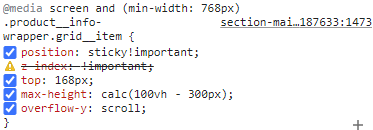
.product__info-wrapper.grid__item {
  position: sticky !important;
  z-index: 999 !important;
  top: 125px;
  max-height: calc(100vh - 300px);
  overflow-y: auto;
}
We hope that this can help you.
1 Like
@BSS-Commerce
Hello and thanks for your reply, this worked but now i have a new problem, when I open my details or size guide, the whole right side jumps up, and also there is white over the text at bottom so you can see everything at once, I want everything to stay the same so it opens below if possible?
Hi @Leonpojen
In our previous CSS code, you can modify the CSS property z-index to a smaller value.
.product__info-wrapper.grid__item {
    z-index: 6!important;
// css other
}
Property z-index when accompanied by elements with CSS position properties like absolute, sticky will decide the order of the elements. The higher the z-index, the closer the element is to the viewer’s eye, which means it will mask the element behind it. That’s why we want you to reduce the z-index.
We hope it will solve your problem. If any problems arise, don’t hesitate to ask questions, we will help you.
1 Like
The problem when i open the collapsible row the whole thing jumps up, please try open details and you will see, i want the everything of the product info except the collapsible rows to open bellow the rest. To be clear i don’t want the product title, price, variant picker or add to cart button to move at all. Not when i scroll and not when i open the collapsible rows, is this possible for you to do?
Hi @Leonpojen
We understand that you want when clicking on details or sizeguild, the product information does not move at all.
We’ve tried clicking on details but we don’t see anything that needs editing. Here is the video
https://www.loom.com/share/b26acc1d08ac446ab5934e589577d4c6
So to support you better, can you kindly provide us with details about the error, and the browser used (with video if possible). A not that we’re using Chrome browser.
@BSS-Commerce
It does for me and I’m on a 13’ Inch Macbook Air, In the video file you will see how it moves.
Here is a picture to clarify what I’m trying to achieve:
Red area: are sopossed to stay still and be sticky (entire time)
Green area: Will be scrollable.
The problem Is that now the green and red area (except header) are scrollable, I only need green area to scroll.
Hi @Leonpojen ,
We didn’t detect your problem just because our screen height is bigger than yours. Thanks to the video you sent, we was able to identify the problem.
To resolve that issue, follow these instructions:
Green and red area (except header) is scrollable, remove it
We found it to be css by the file section-main-product.css in the assets folder of your theme.
Here, change the overflow property to unset. Then you will see the scroll has disappeared.
You need to edit it in your code, We think this won’t be difficult for you right? It will be like this
<div id="use-scroll">
  <div class="product__accordion accordion quick-add-hidden">
                  <details id="Details-75364367-2588-4946-9f89-b0c9534a2dde-template--17819497562379__main">
                    <summary role="button" aria-expanded="false" aria-controls="ProductAccordion-75364367-2588-4946-9f89-b0c9534a2dde-template--17819497562379__main">
                      <div class="summary__title">

                        <h2 class="h4 accordion__title">
                          DETAILS
                        </h2>
                      </div>
                      <svg aria-hidden="true" focusable="false" class="icon icon-caret" viewBox="0 0 10 6">
    <path fill-rule="evenodd" clip-rule="evenodd" d="M9.354.646a.5.5 0 00-.708 0L5 4.293 1.354.646a.5.5 0 00-.708.708l4 4a.5.5 0 00.708 0l4-4a.5.5 0 000-.708z" fill="currentColor">
  </path></svg>

                    </summary>
                    <div class="accordion__content rte" id="ProductAccordion-75364367-2588-4946-9f89-b0c9534a2dde-template--17819497562379__main">
                      <h5>Heavy Weight – 420 Gsm</h5><h5>100% Cotton</h5><h5>French Terry Fabric</h5><h5>Slightly Oversized</h5><h5>Embroidered Logo’s</h5>

                    </div>
                  </details>
                </div>
  <div class="product__accordion accordion quick-add-hidden">
                  <details id="Details-311ba83b-af2b-4c63-8a97-c51b3e0abdd6-template--17819497562379__main">
                    <summary role="button" aria-expanded="true" aria-controls="ProductAccordion-311ba83b-af2b-4c63-8a97-c51b3e0abdd6-template--17819497562379__main">
                      <div class="summary__title">

                        <h2 class="h4 accordion__title">
                          SIZEGUIDE
                        </h2>
                      </div>
                      <svg aria-hidden="true" focusable="false" class="icon icon-caret" viewBox="0 0 10 6">
    <path fill-rule="evenodd" clip-rule="evenodd" d="M9.354.646a.5.5 0 00-.708 0L5 4.293 1.354.646a.5.5 0 00-.708.708l4 4a.5.5 0 00.708 0l4-4a.5.5 0 000-.708z" fill="currentColor">
  </path></svg>

                    </summary>
                    <div class="accordion__content rte" id="ProductAccordion-311ba83b-af2b-4c63-8a97-c51b3e0abdd6-template--17819497562379__main">
                      <h5>We recommend taking your standard size</h5><h5>If you like a more oversized fit you should size up</h5><p></p>

                    </div>
                  </details>
                </div>
</div>
Back to the section-main-product.css file mentioned above, we’ll add a bit of css.
We want screen with height <= 600px to show scroll, while screen with more space won’t show scroll. You can edit this 600px and max-height property to best suit you.
@media screen and (max-height: 600px) {
  #use-scroll {
    max-height: 200px;
    overflow-y: scroll;
 }
}
And this is the final result:
https://www.loom.com/share/3363bd917c5d4eedb22a3d2fd892359a
We hope that this can help you.