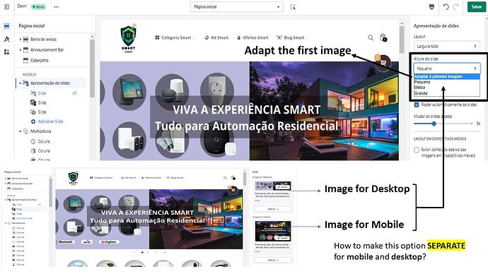
Hey guys,
I have a custom code where I can present separate slide images for mobile and desktop. The code works perfectly. However, I would like to make a modification: How to make the “Adapt first image option” DEPENDENT for mobile and desktop images? Currently, when I select this option, the mobile images are adapting to the first desktop image. This problem ends up reducing the size and quality of mobile images, since the default is for the desktop. This problem ends up reducing the size and quality of mobile images since the default is for the desktop.
My site is: smartcasashop.com.br
Thanks!
Is this option kept enabled or disabled for this post.
At minimum due to lack of detail there would need to be two previews one with the feature on and another with it off because others have no baseline for what the quality/behavior should be.
This the problem with having to test features like this, looking at your current site on desktop and in a mobile browser I cannot tell if the image quality is lower if that’s how they always are.
custom code - Since it’s custom code this is not a simple fix , there’s very little others can infer to guide you to a solution.
Someone would have to spend time on the the code and debug the site while going over the settings.
You should contact whoever made the custom code, or hire someone to add the feature.
If you need this debugged, and customized for you then contact me , info in sig. Please provide context: store url, theme name, post url and detail.
present
Adaptive mobile content strategy - Important make sure this dual presentation is forcing mobile users to still load image content meant for desktop.
Use a tool like google lighthouse to test the storefront mobile scoring with desktop-slides turned off & on.
UX - Also be aware this can create a confusing experience for people using mobile to browser, then come to your site on desktop to browse but the content they are looking for is missing.
Responsive picture images are a more preferable strategy
