I want to make blog content full width in Dawn theme, Both the image and text.
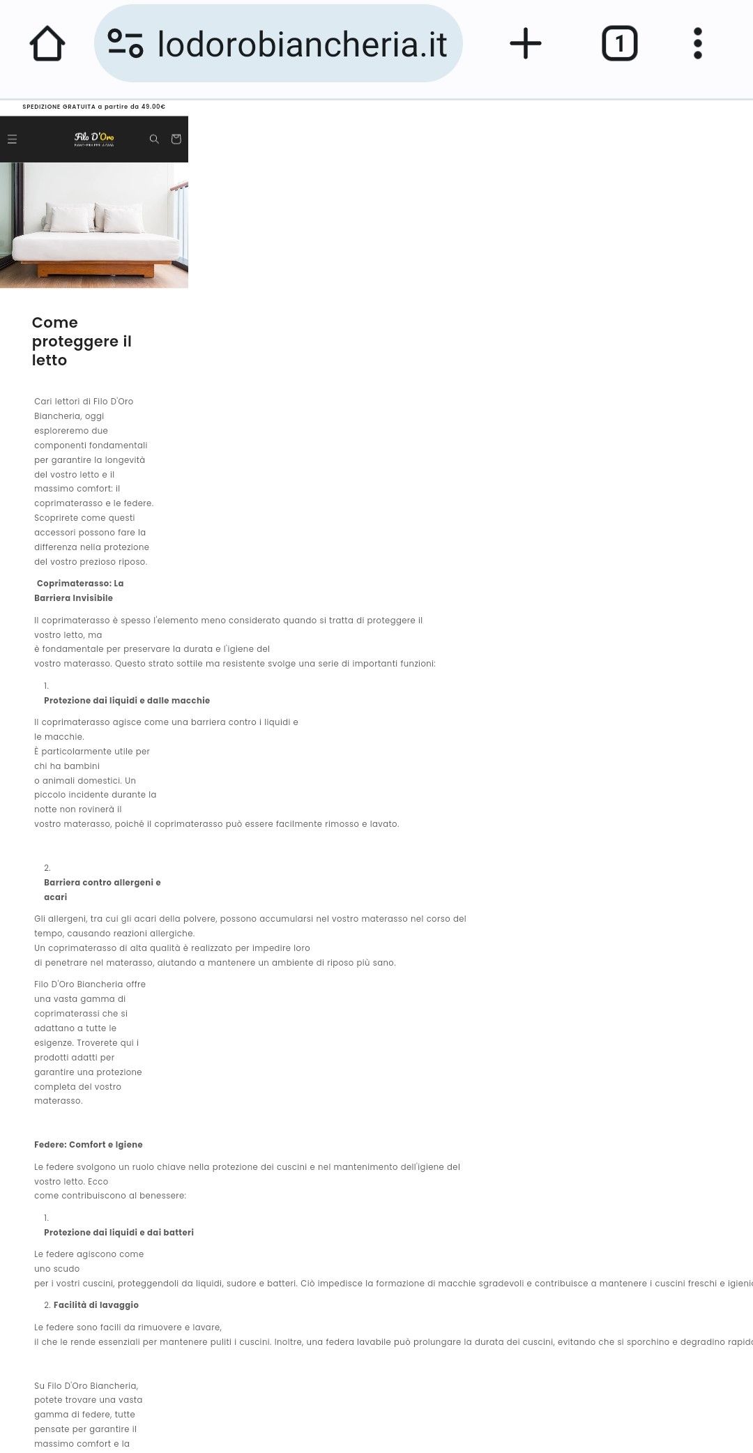
Link to site: https://filodorobiancheria.it/blogs/come-proteggere-il-letto/come-proteggere-il-letto
I want to make blog content full width in Dawn theme, Both the image and text.
Link to site: https://filodorobiancheria.it/blogs/come-proteggere-il-letto/come-proteggere-il-letto
Hi @Faseeh1897
Try this one.
.main-blog.page-width.section-template--19020050628944__main-padding {
    padding: 0px !important;
}
@media screen and (min-width: 990px){}
.title--primary {
    margin: 2rem;
}
}
.rte-width {
    max-width: 100%;
}
Hey @Faseeh1897
Follow these Steps:
Go to Online Store
Edit Code
Find theme.liquid file
Add the following code in the bottom of the file above tag
RESULT:
If I managed to help you then, don’t forget to Like it and Mark it as Solution!
Best Regards,
Moeed
Works fine but can I have a bit of margin as the text sticks completely to the side of the page. Just a little bit of space, Thanks.
Sorry, didnt work
Oh sorry, that is on the main blog page. When I click your provided link the images are on the max width. And when i click the back to blog then the provided picture you give come  .
.
Try this one for the margin.
Same Instruction.
.article-template__content.page-width.page-width--narrow.rte {
    margin: 0 5.5rem !important;
}
And Save.
Result:
I align in your footer.
Still acting a bit weird, the left is fine but there is a huge gap on the right. Also the heading doesnt look center aligned.
I check again but page not found.
Here is the new link: https://filodorobiancheria.it/blogs/il-blog-di-filo-doro-biancheria/come-proteggere-il-letto
Thanks for the info, try this one.
header.page-width.page-width--narrow {
    margin: 5rem !important;
}
@media screen and (min-width: 990px){
.page-width--narrow {
    max-width: 100% !important;
}
}
Sorry, I miss some bracket can you try it again? Thanks!
I already provide the code for that, please review my previous comment. Just remove the .5 so it will align on the header. Thanks!
No I want the same gap as the header on the text below. Removing 5 removes the gap on the header. I want to have the gap but on both the header and the text below.
The header position is perfectly fine, I just want the text below to align with it.
As I told you again I already provide the code for the paragraph below align with header. On the previous comment I have in this post. I give margin: 0 5.5rem for the paragraph and 5rem for the header. Anyway, It up to you. Thanks!
Oh sorry I misunderstood. Now its all fine just the text is going outside the screen from the right side which is activating horizontal scroll on the page, how can I fix this?
And the page on mobile is displaying weirdly as well, have a look at the screenshot below of the mobile view. Also the margin on the left in mobile seems to be too much.
Please reply, Thanks.