Hi my store link is here I have also uploaded an image of the issue.
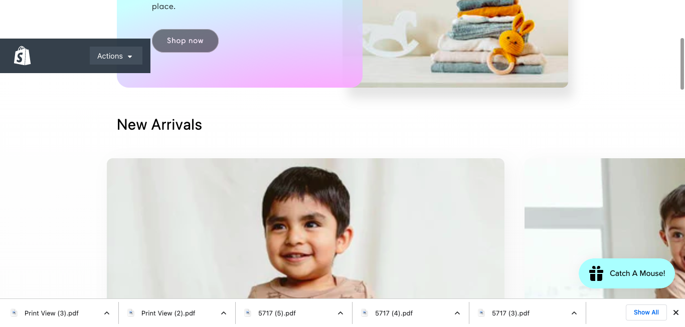
I am trying to make my featured collection “New Arrivals” on my main page smaller. As you can see on the desktop, it cannot fit into one screen shot. The pictures in the collection are only 600 x 600 px. I appreciate any help!
@Maddielynn
Please add the following CSS code to your assets/ component-slider.css bottom of the file.
@media screen and (min-width: 990px){
.slider--desktop.grid--1-col-desktop .grid__item {
    width: calc((25% - var(--desktop-margin-left-first-item)) - var(--grid-desktop-horizontal-spacing) * 9) !important;
    margin-left: auto !important;
}
}

@media screen and (min-width: 990px){
.slider--desktop {
    max-width: 950px !important;
    margin: 0 auto !important;
}
}
Thanks!
1 Like
Thank you so much!!! It worked perfectly!
1 Like