Dear all,
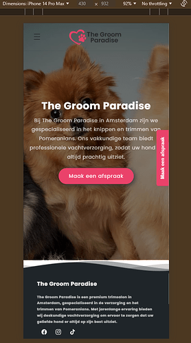
Question about Dawn theme, I’ve followed an tutorial on Youtube for a transparent header in dawn theme which is only made for desktop and not on mobile.
on desktop it works perfectly, just as I want, but my question is, how can I change the code so it works also on mobile version.
Website: https://b6c7e8-65.myshopify.com/
Pass: test
It’s not an shop, it will be a standard website for grooming.
In case you need anything from my site, please let me know, would love to have this working.
Kind regards,
Lisa,
1 Like
@Lisavdijk , Add this code above tag in theme.liquid file
Result:
Hi all,
Thank you for your replies,
is there any chance that I can add my header file from edit code here, so we can make the adjustments there?
as this is a sticky header, when you scroll down background changes to white and logo changes to black text instead of white.
this is my header.liquid code
https://paste.ofcode.org/Vmz9Y3HEZCCv8nm2eisPkc
Thank you all in advance.
Kind regards,
Lisa
1 Like
I have added code there, please check it @Lisavdijk .
1 Like
Hi Teklabs,
Many thanks, this worked for mobile, but is there a chance to add my white logo when it’s not scrolled, and when you scroll the black logo?
like the desktop version?
also if possible, the hamburger is in black, is it possible to make it white, and when you scroll back to black?
appreciate your great help 
Kind regards,
Lisa
1 Like
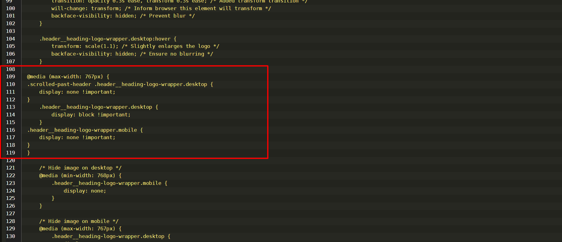
@media (max-width: 767px) {
.scrolled-past-header .header__heading-logo-wrapper.desktop {
    display: none !important;
}
    .header__heading-logo-wrapper.desktop {
        display: block !important;
    }
.header__heading-logo-wrapper.mobile {
    display: none !important;
}
}
1 Like
I have added code from line 109 to 116 you can try it @Lisavdijk .
1 Like
Im updated code line 109 to 119 @Lisavdijk
1 Like
Hi Teklabs,
many thanks, was about to say that is wasn’t working as it should, but now it does 
In case you want me to help out, is it also possible to make this menu hamburger white when it’s not scrolled, and black when it’s scrolled?
Once again, im really thankful for your great help 
with my OCD, i need to get this fixed to get rest in my head haha
Kind regards,
Lisa,
1 Like
I am updated the code. please check it @Lisavdijk
1 Like
@media (max-width: 767px) {
.scrolled-past-header .header__heading-logo-wrapper.desktop {
    display: none !important;
}
    .header__heading-logo-wrapper.desktop {
        display: block !important;
    }
.header__heading-logo-wrapper.mobile {
    display: none !important;
}
.scrolled-past-header .icon-hamburger path {
    fill: black !important;
}
.icon-hamburger path {
    fill: white !important;
}
}
1 Like
Hi Teklabs,
Appreciate your help, it works just as I want, really appreciate the effort and quick answers.
Kind regards,
Lisa
1 Like
Glad to help you. Have a good day @Lisavdijk .
1 Like
Hi Teklabs, once again,
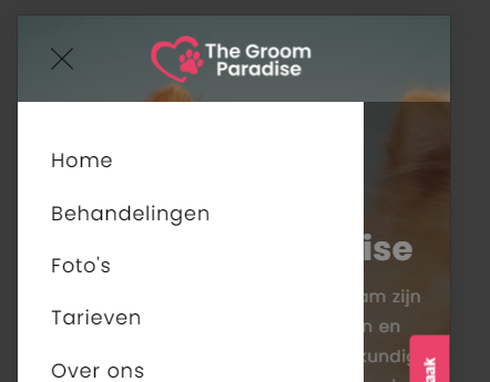
apologies, maybe asking too much, but upon checking i noticed when you press menu it shows as below picture
Any chance that we can make header back ground white and logo black when they press menu without past header?
Sorry for additional step.
Kind regards,
1 Like
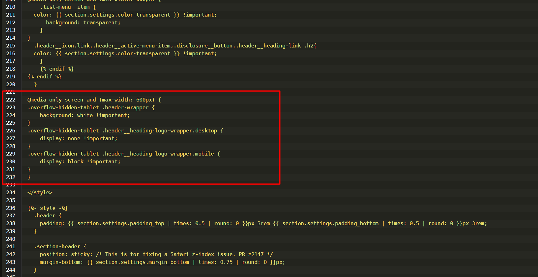
@media only screen and (max-width: 600px) {
.overflow-hidden-tablet .header-wrapper {
    background: white !important;
}
.overflow-hidden-tablet .header__heading-logo-wrapper.desktop {
    display: none !important;
}
.overflow-hidden-tablet .header__heading-logo-wrapper.mobile {
    display: block !important;
}
}
Im add code to line 222 to 232 please check it @Lisavdijk
1 Like
Hi,
Ur the best, thank you once again for helping me out,
Kind regards,
Lisa
1 Like


