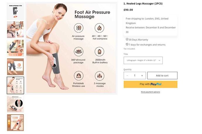
- How to make product description images smaller for mobile view compared to desktop (the image sizes on the desktop version do not fit on the mobile version) so a way to make it smaller or have separate images for both one for mobile and one for desktop?
https://snipboard.io/owULGI.jpg (as u can see the images do not fit on the mobile view) so can you make it separate for desktop and mobile) or is there another way?
store link: https://0nu4nc-ra.myshopify.com/products/example-t-shirt
currently using Dawn theme 12.0.0
- how to make the product image stop moving up and down when scrolling https://snipboard.io/RhdPHB.jpg and how to enlarge it to a fixed size?
1 Like
Hi Anthony, yes please give more details
thanks
Hi @snnggest !
For problem 1:
Head to Admin > Themes > Customise > example t-shirt page
Select the area containing the image and add the following to your Custom CSS section (in the right side-bar):
img {
  width: 100%;
}
This will result in the image fitting in the container as shown below:
For problem 2:
Head to Admin > Themes > Customise > edit code > file section-main-product.css > around line 1602:
Currently css is set to:
@media(min-width: 991px){
  .slider-mobile-gutter{
    position: sticky;
    top: 160px;
    height: max-content;
  }
}
The position: sticky; is causing the image to move as the page scrolls. Changing position to relative, will keep it in place.
Currently, the top: 160px sets all the images out of alignment with the product description:
Setting top to 0px will remove the top gap:
For easy copy and paste:
@media(min-width: 991px){
  .slider-mobile-gutter{
    position: relative;
    top: 0px;
    height: max-content;
  }
}
Hope this helps!
1 Like
thanks for the reply, the codes worked.
how do I now the image slider to how it is on mobile view? instead of it being stacked on the left side of the image
mobile:
desktop:


