Hi!
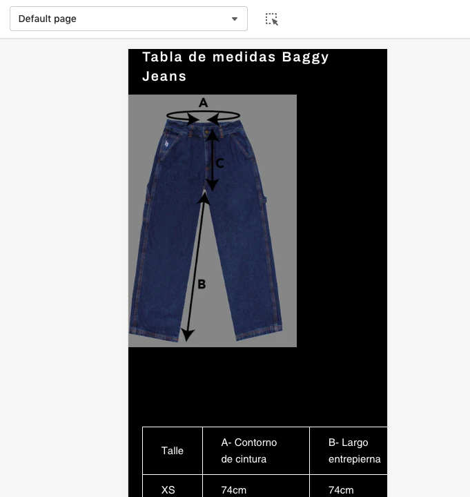
I need to create a page with size charts, but the tables are not responsive to mobile screen.
On desktop the table looks ok but on mobile it gets cut off.
How can I solve it?
Thanks in advance!
Hi!
I need to create a page with size charts, but the tables are not responsive to mobile screen.
On desktop the table looks ok but on mobile it gets cut off.
How can I solve it?
Thanks in advance!
Hello @hesh ,
You can follow these steps:
I hope the above is useful to you.
Kind & Best regards,
GemPages Support Team
Hi @hesh
I hope you are doing good and welcome to the Shopify Community!
I am San from MS Web Designer.
Please add this css in your bottom of the css file:
@media only screen and (max-width: 750px) {
#tabla-de-medidas-baggy-jeans .rte.rte–indented-images {width: 100%; overflow-x: scroll;}
}
Regards,
San
This didn’t work for me. When I look at the HTML code of the table it still says:
Example page:
https://nerdchicboutique.com/products/intergalactic-meltdown-long-sleeve-concert-hoodie