A user seeks to make their mobile menu display in a single horizontal line like the desktop version, instead of appearing oversized with elements in separate boxes.
Proposed Solution:
Another user suggests making the mobile header scrollable horizontally using custom CSS
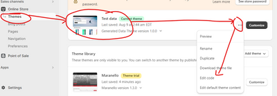
Includes step-by-step instructions: navigate to Online Store > Themes > Edit, locate “theme.liquid”, and add CSS code above the </head> tag
Screenshots demonstrate the implementation process and expected result
Additional Requests:
Two other users request similar assistance for their own Shopify stores
One wants to replace the hamburger menu view with a single-row layout matching desktop
Status: The thread remains open with multiple users seeking help. The initial solution has been provided but not yet confirmed as implemented or successful.
Summarized with AI on November 12.
AI used: claude-sonnet-4-5-20250929.
Not sure if anyone can help me. I’ve attached both my mobile and desktop screen here. How can I make my mobile view appear the same as my desktop view? Currently, my menu looks too big on my phone and the other menu is in the box. The font looks too big as well in my mobile. I’m hoping to have both menu in my phone in straight line like the desktop if possible. Thanks!
If you require further help to optimize your store, please don’t hesitate to reach out. If you find this information useful, a Like would be greatly appreciated. And if this solves the problem, please Mark it as Solution!