How to optimize banner size for desktop and mobile?

Hope someone can help.

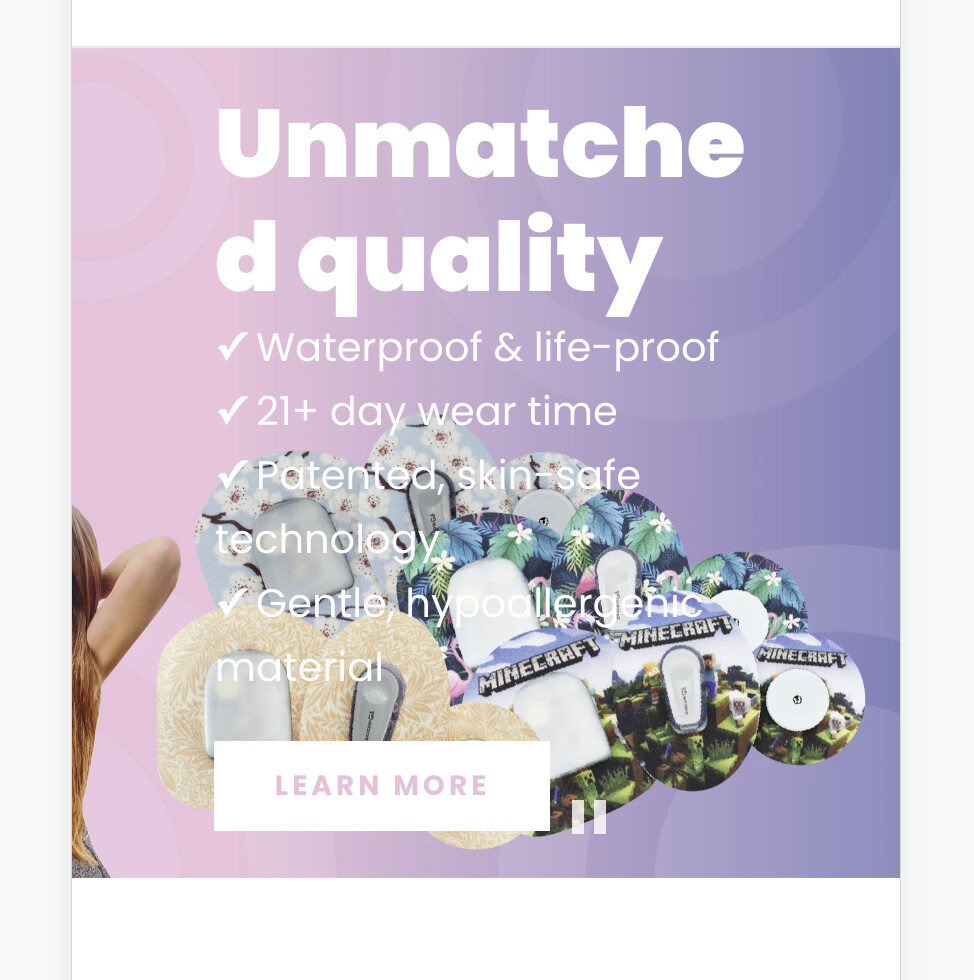
We’re having issues when it comes to optimizing our front page banners to work on both mobile & desktop. We are using the Envy by Eight theme.

There is an option to upload a desktop banner and mobile banner, which we have done, however, the text that sits on top does not work for mobile at all. It needs to be smaller, but the theme only allows for editing text globally for both desktop & mobile, so we can’t figure out how to adjust one and not the other. We are happy with the desktop layout, we just need the mobile layout’s text to be smaller.

DESKTOP:

MOBILE:

I’d appreciate your help.

Thanks!

hii, @gwevs
Kindly share your store URL so,
I can solve your issue.
Thank you.

http://type-one-style.myshopify.com/

@gwevs
Sorry, I can’t see your banner.
Thank You.

https://p85fxosq0p8690kq-55040016558.shopifypreview.com

@gwevs
Paste this code at the top of the theme-index.min.css file.

@media only screen and (max-width: 768px) {
h2.slideshow-fade-content a {
    font-size: 20px !important;
}
}

Thank You.

Thanks so much!

@gwevs
Welcome.

The first slide works (the title could be bigger), however, the 2nd and 3rd slides are still not working? Is this something I need to do myself by targeting the mobile query with custom CSS?

Hi,

I am also facing an issue with my website

www.atmanindia.com

The banners as of now are basic to work with mobile, but I wish to use pre-designed banners, which are good for desktop but get cropped for mobile.