Hi there, I would like to reposition the product page paginations slider onto the product image itself rather than having it under the product image.

1 Like
Hi @crepscity
Check this one.
- From you Admin page, go to Online Store > Themes
- Select the theme you want to edit
- Under the Asset folder, open the main.css(base.css, style.css or theme.css)
- Then place the code below at the very bottom of the file.
@media only screen and (max-width: 749px){
.product__media-wrapper .slider-buttons {
    position: absolute;
    z-index: 10;
    right: 0;
    bottom: 5%;
}
}
- And Save.
- result:

Please don’t forget to Like and Mark Solution to the post that helped you. Thanks!
1 Like
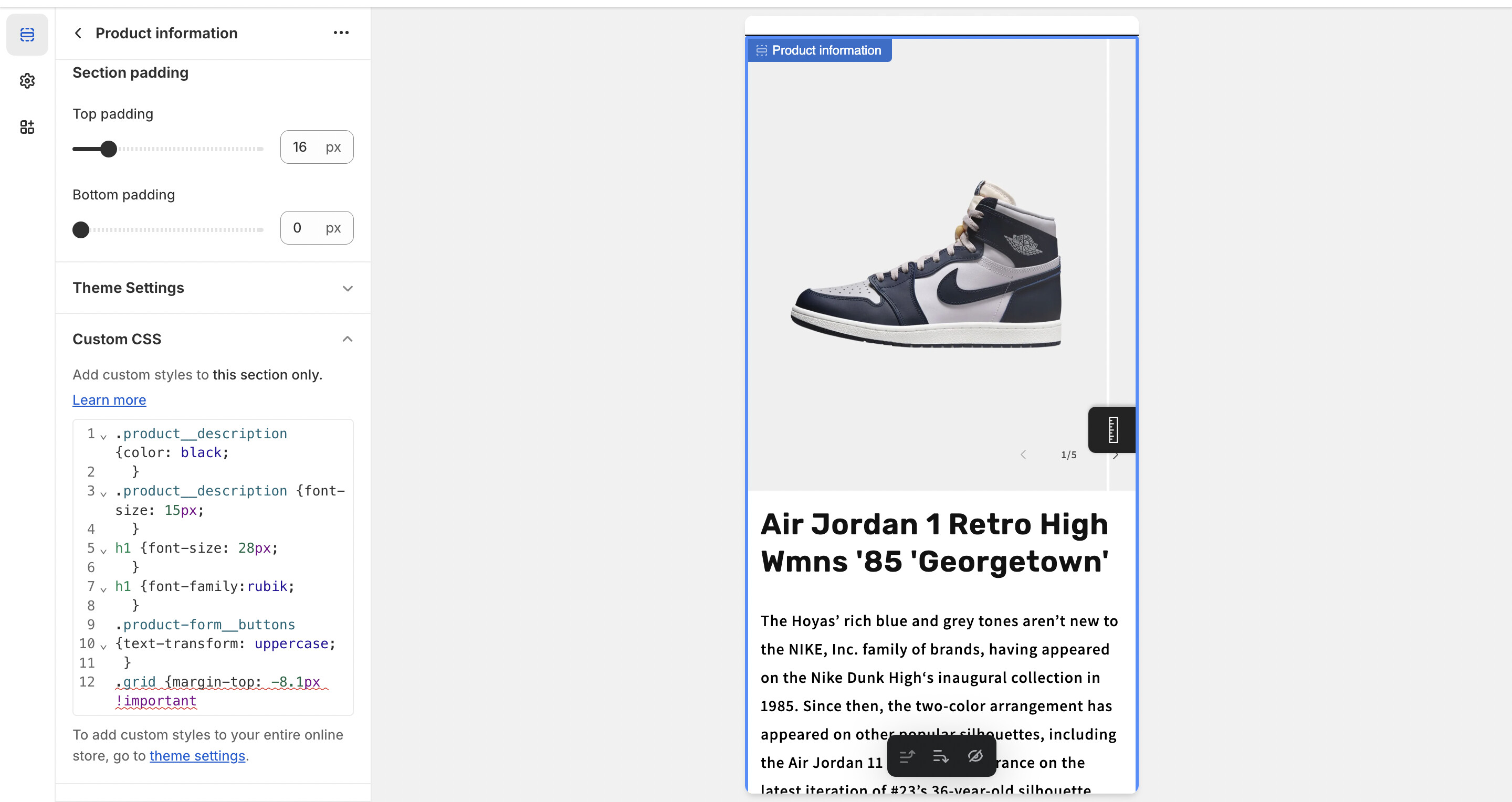
It worked, looks amazing thank you. Also, how can i push up everything under neat the product image like the title, description ect, right under the product image.

Add this code. On base.css.
.product__media-list.contains-media.grid.grid--peek.list-unstyled.slider.slider--mobile {
    padding-bottom: 0px;
    margin-bottom: 5px;
}
And Save.
Result:

Please don’t forget to Like and Mark Solution to the post that helped you. Thanks!
1 Like
Would you know how to close the white gap on the left side of the product page for *desktop only, mobile is perfect. I was able to close the gap for the top but not the left side.

Also, would you know how to add a ‘READ MORE’ button for the product description product collection instead of showing the hole description, for example shop the first 3 sentences of the product description but for the 3rd line can you make it semi blurry then ‘READ MORE’


Sorry, I can only help you with the prouct width. But adding the “read more” that need a developer to add some liquid code in your store.
same instruction.
section#MainProduct-template--16107583570159__main {
    max-width: 100%;
    padding-left: 0px;
}
And Save.
Result;

Please don’t forget to Like and Mark Solution to the post that helped you. Thanks!
Okay thank you, but in regards to the product page, ive tried the above code and placed it into the files Base.css & Theme.liquid but nothing. What file should i place the code as you didn’t mention what file?
This is the code i have on my product page css below, but do you have a code that triggers the full width for mobile and desktop as this code really worked for mobile version but not desktop. Also, for desktop version, i don’t want the product title to go higher with the product image.

Did you try to add !important.
section#MainProduct-template--16107583570159__main {
    max-width: 100%;
    padding-left: 0px;
}
And Save.
Also in your base.css you miss 1 bracket.
there must be 2 closing bracket for this code.

Must be like this.

Add the bracket before pasting the code. Thanks!
Please don’t forget to Like and Mark Solution to the post that helped you. Thanks!
it worked for desktop perfectly however, for mobile it shifted everything like titles, description ect, to the left of the screen instead of the middle?

Any solution for this. i only want to shift the image to left for desktop only as this code above is triggering the phone version as-well?