(Note: the shop URL is at the very bottom)
Hey there, as I said in the subject line, I need help with editing the size of my product cards and also the gap between them. Let me first provide you with a visual example.
Here’s what I have:
Here’s approximately what I want:
The main differences are the size of the gap between cards, the overall size of cards, and the distance to the sides of the screen. I tried doing it myself, but I faced a few problems. The first is that when I tried changing the gap between cards on the one I wanted (17.5px), it caused the last product in the first column to move to the next column. I believe it happened because of the borders the collection section has. See the images below to get what I mean.
It went from this:
To this:
Because of this:
But I didn’t get how to move this limiting border further to make it possible for me to fit 4 products in a row with a 17.5px gap between them. So I need help with that. In case it’s not possible to move this border, or I won’t get the result I want from moving it, then I need help on how to achieve that result differently.
Talking about the size of each product card, I just haven’t figured out how to edit the size properly, cause all I’ve found on this matter is the “page width” setting which besides the page width also affects product card size, but that’s it. So if there’s any other setting for that, can you please show me where to find it?
My store URL is: https://trivlen.com/
Hi @Chicha7272
Please add this code to your theme.liquid file before tag to solve the issue with your products
1 Like
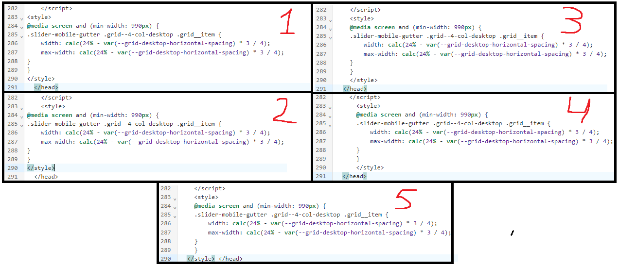
Hey, thanks for helping me again. I tried pasting this code in many different ways but in the end, I didn’t make this work. Can you please guide me on where to paste it exactly? See images below
This is the first place where I tried pasting it:
This is the second:
And none of those worked. The problem could also be how I pasted it. See the images below to get what I mean
These are some of the ways I tried pasting it:
So what do I need to do to make it work?
Hi @Chicha7272
Please update the cod to this and also change the gap setting
1 Like
This code works, thanks a lot man
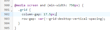
Just noticed one more thing. After I applied the last code you provided me, it caused a problem with the following part:
As you can see, it’s the same problem as I had before. Can you help me fix this thing too, please?
The code I sent you applied to featured product section only, please update code to this to applied for all product card section
1 Like
Excuse me, Dan, it’s not your code that created the problem that I showed in the previous image, it’s how I changed the column gap. You see, when I applied the code you sent me, you asked me to change the column gap myself. So I accidently changed the column gap on the entire website and not on the featured product section only. In my last message, I didn’t mean that I need your help with the code for all product cards, I just wanted to ask you how to make the “You may also like” section look as before. To put my question simply, I’m asking where can I change the column gap on the featured product section only? Cause this is where I changed it last time and it was wrong:
So where do I need to go to change it only for the featured product section?
Hi @Chicha7272
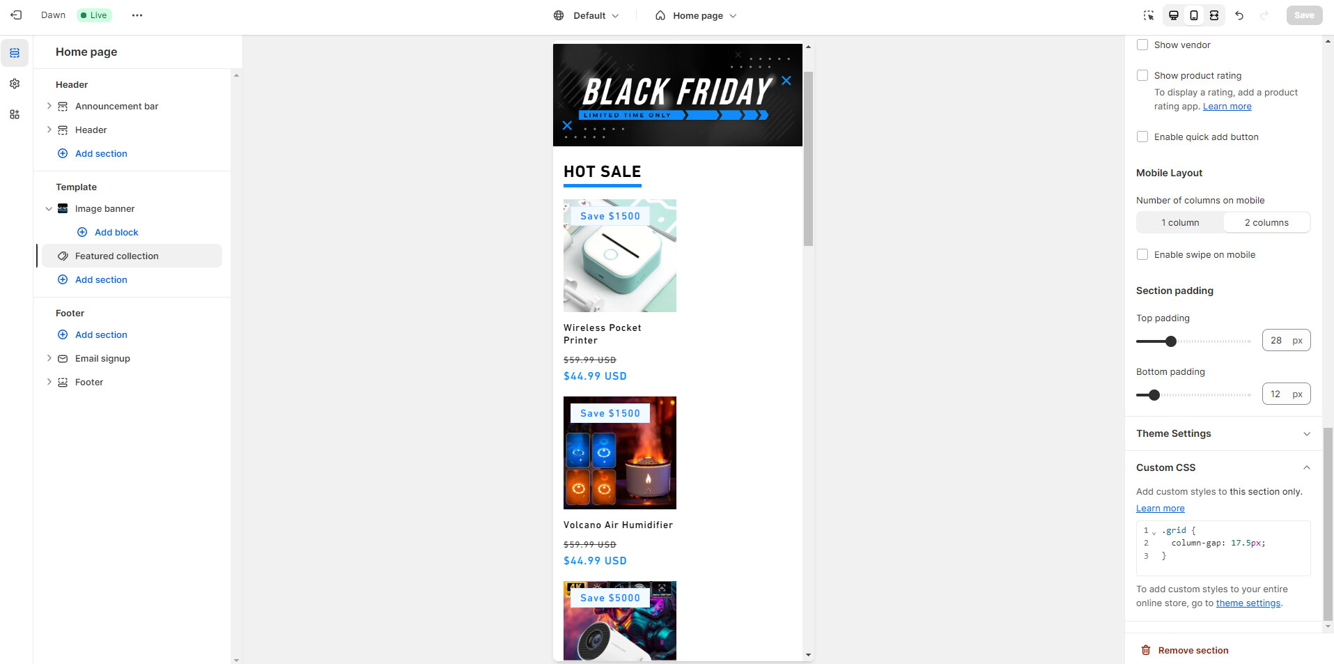
To change column-gap of featured product section o your home page, you can add the code in image to Custom CSS of featured product section in your Online store > Themes > Customize
Or add this ID before .grid so it should be like this
#shopify-section-template--20103583957316__featured_collection .grid
1 Like
It worked, thank you a lot. You genuinely are a hero, Dan
1 Like
Just noticed one more thing. The code I added here also applies to the phone version of the website:
So as good as it looks on the desktop, this is what it looks like on the mobile:
Is there a way to make this code apply to desktop version only?