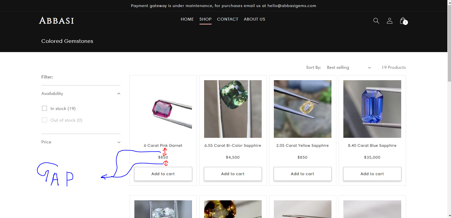
Hello, Please refer to the picture below for clarification:
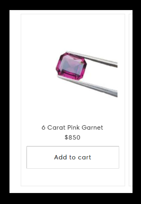
As you can see the gap between the product title, product price and the quick add button is way too high, and I would like to reduce the gap between them all the way to zero, to make it look something like this below in the picture:
URL: https://abbasigems.com/collections/colored-gemstones?page=1
Password: testingpage
Please select a collection from the shop menu in the header and then you will see this page
Thank you, I Hope I explained it clear hehe
Any sources or help are much appreciated!
@justauser
It’s GemPages support team and glad to support you today.
I would like to give you a solution to support you.
-
Go to Online Store → Theme → Edit code.
-
Open your theme.liquid theme file.
-
Paste the below code before :
Hope my solution can work and support you!
Kind & Best regards!
GemPages Support Team.
Hi @GemPages , the code you posted worked but will it have an impact on the responsiveness of the component? for example would it okay with different screen sizes?
Thank you
@justauser
You can check on mobile, note that because the buttons align at the bottom of the products, there may be more spacing below the price.
@GemPages Yep in the mobile version it works all good! Thank you!