Hello everyone,
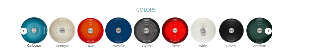
I am trying to achieve the following layout on my website
I tried to copy the same code, but learnt here that it couldn´t be possible.
So I am trying to accomplish that using my theme´s code and I got the following result:
I want to know if I can include some sort of code to make the pictures smaller? and if there´s any way to show those 8 collections in a same row?
This is the code I am using in the Mosaic theme:
{% schema %}
{
  "name": "Collection list",
  "class": "collection-list--section",
  "max_blocks": 20,
  "settings": [
    {
      "type": "text",
      "id": "title",
      "label": "Heading",
      "default": "Collection list"
    }
  ],
  "blocks": [
    {
      "type": "collection",
      "name": "Collection",
      "settings": [
        {
          "id": "collection",
          "type": "collection",
          "label": "Collection"
        },
        {
          "id": "image",
          "type": "image_picker",
          "label": "Image"
        }
      ]
    }
  ],
  "presets": [
    {
      "name": "Collection list",
      "category": "Collection",
      "blocks": [
        {
          "type": "collection"
        },
        {
          "type": "collection"
        },
        {
          "type": "collection"
        },
        {
          "type": "collection"
        }
      ]
    }
  ]
}

{% endschema %}
Welcome to shopify community.
Please share your store URL and if your store is password protected then please provide password too.
Thank you.
1 Like
Hi @sukalde ,
Please send your site and if your site is password protected, please send me the password. I will check it.
1 Like
Hi @sukalde ,
Go to Assets > theme.css and paste this at the bottom of the file:
@media screen and (min-width: 860px) {
	.home-section--content.collection-list--inner {
		display: flex;
	}
	.home-section--content.collection-list--inner .collection--item {
		margin-top: 0 !important;
	}
}
@media screen and (max-width: 859px) {
	.home-section--content.collection-list--inner {
		flex-wrap: wrap;
	}
}
Hope it helps!
Yay!
Its working, one last question, can I somehow limit that code to only the following section:
{% section ‘dynamic-collection-list-smeg2’ %}
Right now my others sections are also changed
And I am only looking to edit the following section:
{% section ‘dynamic-collection-list-smeg2’ %}
Hi @sukalde ,
First, you need to add a class to distinguish the section here:
Code:
After that, change the CSS code I instructed before to the following code:

```css
@media screen and (min-width: 860px) {
	.dynamic-collection-list-smeg2 .home-section--content.collection-list--inner {
		display: flex;
	}
	.dynamic-collection-list-smeg2 .home-section--content.collection-list--inner .collection--item {
		margin-top: 0 !important;
	}
}
@media screen and (max-width: 859px) {
	.dynamic-collection-list-smeg2 .home-section--content.collection-list--inner {
		flex-wrap: wrap;
	}
}
If it helped you solve your issue, please mark it as a solution. Thank you and good luck.
1 Like
Thank u so much for the quick reply, it worked! 
1 Like
i also want to do the same with my collection list I’m using warehouse theme
could you please help me i also want to do the same with my theme collection list I’m currently using ware house theme
@LitCommerce I need the something similar on my Collection List page, the images are too big and I cannot figure out how to make them smaller. I am using Symmetry theme.
@LitCommerce can you help me do this exact same thing with Spotlight theme? Happy to donate!
My site is www.disappearhere.org


