Hi!
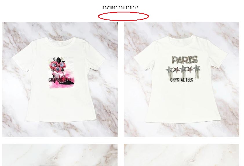
I would like to reduce the space on top and bottom of product grid in featured collections hat shows up on the homepage. Mainly there is huge gap between the last image row and the “View All” button. Below is a reference of the the whitespace I would like to reduce marked in red.
My website is pynappleplace.com.
Any help would be greatly appreciated!
Thanks.
Dae
2 Likes
@ThomPyn
Please add the following code at the bottom of your assets/theme.css file.
@media only screen and (min-width: 750px){
div#shopify-section-featured-collections .section-header { margin-bottom: 10px; }
div#shopify-section-featured-collections hr { margin-top: 0px; }
}
Hope this works.
Thanks!
@ThomPyn
- Go to Online Store->Theme->Edit code
- Asset->/theme.css ->paste below code at the bottom of the file.
this code apply for after 5 - 6 second
#shopify-section-featured-collections .section-header {margin-bottom: 0px;}
#shopify-section-featured-collections .hr--invisible {
    border-bottom: 0;
    margin: 30px 0px 0px;
}
1 Like
Hey,
I tried this one but it didn’t change the spaces.
Do you know what could be the reason for this? It’s on Debut theme.
Thanks.
1 Like
@Katie89
Sorry for facing this issue, it’s my pleasure to help us.
Welcome to the Shopify community!
and Thanks for your Good question. 
Please share your site URL,
So I will check and provide a solution here.
Thanks this worked!
However it didn’t adjust the spacing on other featured collections. How can I reduce the spacing for other grids on the homepage (below) to be uniform to the first one that has been fixed?
On another note, I want to reduce whitespace on the product page (below “Buy it now” and above the “Reviews”.
Again any help would be appreciated!
@ThomPyn
Please add the following code at the bottom of your assets/theme.css file.
CSS for reduce the spacing for home page
@media only screen and (min-width: 750px){
.section-header {margin-bottom: 0px !important;}
}
Hope this works.
Thanks!
Thanks it worked, but didn’t apply on mobile settings. How can I apply to mobile view as well?
I took out the top line and now it is showing up properly on both mobile and desktop. Below is the revised code.
.section-header {margin-bottom: 0px !important;}
}
@ThomPyn
Please use the following code for the mobile.
@media only screen and (max-width: 749px){
.section-header {margin-bottom: 0px !important;}
}
Let me know if this works.
Thanks!
Hi, this code doesn’t work for me. I’m on the Narrative theme and wish to reduce the white space immediately below my featured collection on my homepage.
Can you/anyone help please?
1 Like
@NUSASWIM
Please share your store URL.
Thanks!
@NUSASWIM
Sorry you are facing this issue, it would be my pleasure to help you.
Welcome to the Shopify community!
Thanks for your good question.
Please share your site URL,
@NUSASWIM
Please add the following code at the bottom of your assets/theme.scss.liquid file.
@media only screen and (min-width: 750px){
.card__wrapper {margin-bottom: 0px !important;}
.featured-collection .card-list {margin-bottom: 0px !important;}
.featured-collection {padding: 30px 0 !important;}
.featured-collection__heading {margin-bottom: 30px !important;}
}
@dmwwebartisan
Thank you, that seems to have reduced the white space on the web view but hasn’t made a difference on the mobile view. Could you let me know what code needs adding to remove the gap in mobile view please?
@NUSASWIM
Please add the following code at the bottom of your assets/theme.scss.liquid file.
@media only screen and (max-width: 749px){
.card__wrapper {margin-bottom: 0px !important;}
.featured-collection .card-list {margin-bottom: 0px !important;}
.featured-collection {padding: 30px 0 !important;}
.featured-collection__heading {margin-bottom: 30px !important;}
}
Thanks!
1 Like
Thank you @dmwwebartisan that’s worked perfectly!