How to replace footer text box with the newsletter?

I attached tow photos below, in the 1st one the email newsletter is at the bottom and I tried different ways to move it up, but then it was ruined on the mobile page. (I don’t know how to code, just tried to edit some margine and padding zones)

The 2nd photo has the email newsletter where I want it, (I did that with inspect element), but I don’t know how to do it in the shopify theme code editor.

My store: Cinessentials.com

Pasword: cine

Thank you

1 Like

Hi @Rob06

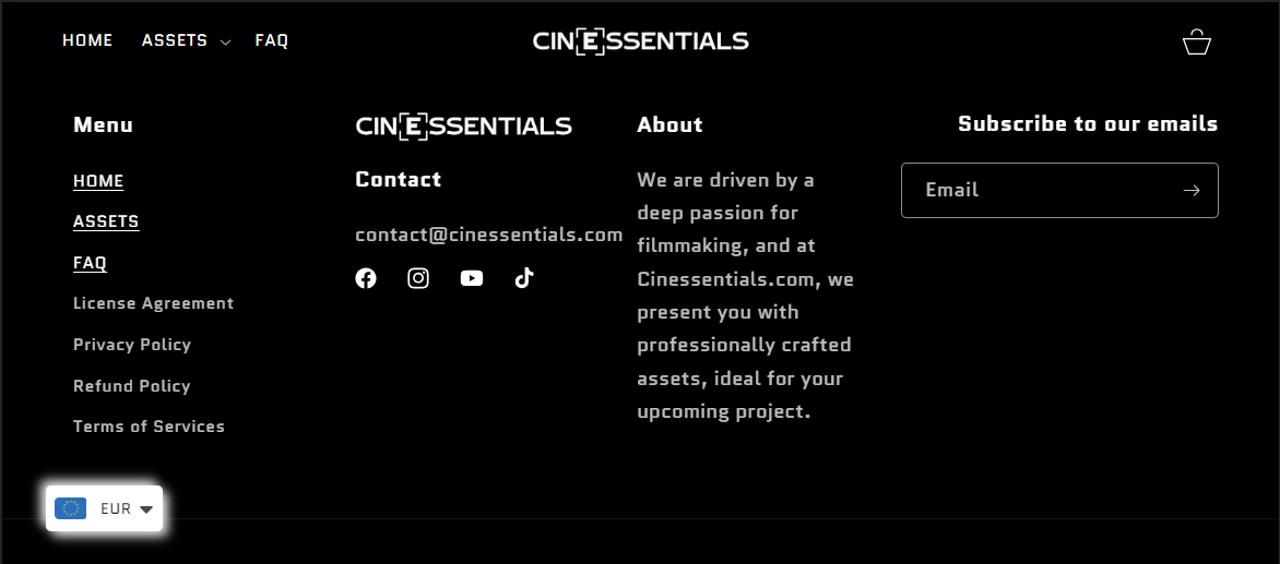
Check this one. I manage to do it on desktop only. And it seems your screen is more wider than me, it maybe there is some problem when try it in your screen.

  • From your Shopify admin dashboard, click on “Online Store” and then “Themes”.
  • Find the theme that you want to edit and click on “Actions” and then “Edit code”.
  • In the “Assets” folder, click on “base.css, style.css or theme.css” file, depending on which file your theme uses to store its CSS styles. At the bottom of the file, add the following CSS code:
@media only screen (min-width: 1170px){
.footer-block__newsletter {
    display: flex;
    flex-direction: column;
    align-items: flex-end;
}
.footer__blocks-wrapper.grid.grid--1-col.grid--2-col.grid--4-col-tablet.scroll-trigger.animate--slide-in {
    display: grid;
    grid-template-columns: repeat(3, 1fr);
    grid-template-rows: 1fr;
    align-items: start;
    padding: 10px;
    gap: 0px;
    width: 75%;
}
#shopify-section-sections--19468188975447__footer > footer > div.footer__content-top.page-width > div.footer__blocks-wrapper.grid.grid--1-col.grid--2-col.grid--4-col-tablet.scroll-trigger.animate--slide-in > div.footer-block.grid__item.footer-block--menu.scroll-trigger.animate--slide-in {
    width: 200px;
    height: auto;
    
}
.footer-block.grid__item.scroll-trigger.animate--slide-in {
    width: 200px;
    height: auto;
}
.footer-block__newsletter {
    position: absolute;
    right: 0px;
    bottom: 220px;
}
}

I hope it help.

Please don’t forget to Like and Mark Solution to the post that helped you. Thanks!

1 Like

When I use the provided code it messes up the footer on the mobile website.

1st pic is how it looked before the code and 2nd one is how it looks now.

The 3rd pic is okay, but if you could maybe align the text ‘‘Subscribe to our emails’’ to the left. (Edit: I attatched a image on how I want it to look like on pc)

1 Like

Oh sorry there are some misplace bracket now its good. This code only for desktop view.

1 Like

Now its back like it was before.

I try my best to arrange them properly in desktop an mobile.

@media only screen and (min-width: 749px) {
.footer-block__newsletter {
    display: flex;
    flex-direction: column;
    align-items: flex-end;
}
.footer__blocks-wrapper.grid.grid--1-col.grid--2-col.grid--4-col-tablet.scroll-trigger.animate--slide-in {
    display: grid;
    grid-template-columns: repeat(3, 1fr);
    grid-template-rows: 1fr;
    align-items: start;
    padding: 10px;
    gap: 0px;
    width: 75%;
}
#shopify-section-sections--19468188975447__footer > footer > div.footer__content-top.page-width > div.footer__blocks-wrapper.grid.grid--1-col.grid--2-col.grid--4-col-tablet.scroll-trigger.animate--slide-in > div.footer-block.grid__item.footer-block--menu.scroll-trigger.animate--slide-in {
    width: 150px;
    height: auto;
    
}
.footer-block.grid__item.scroll-trigger.animate--slide-in {
    width: 200px;
    height: auto;
}
.footer-block__newsletter {
    position: absolute;
    right: 0px;
    bottom: 220px;
}
#shopify-section-sections--19468188975447__footer > footer > div.footer__content-top.page-width > div.footer__blocks-wrapper.grid.grid--1-col.grid--2-col.grid--4-col-tablet.scroll-trigger.animate--slide-in > div:nth-child(2) {
    margin-left: -80px
}
}
@media (max-width: 999px){
.rte p:nth-child(1) {
    word-break: break-word;
}
}
@media (min-width: 749px) {
.newsletter-form {
    max-width: 20rem;
}
}
@media only screen and (max-width: 749px) {
.footer-block--newsletter.scroll-trigger.animate--slide-in {
    align-items: flex-start;
}
}

Please don’t forget to Like and Mark Solution to the post that helped you. Thanks!

1 Like

Thank you, this worked.

1 Like