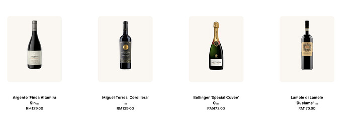
Hello, I need some help with the layout of my products. Is it at all possible to scale or lock the way my product images look through different screen sizes?
For example: this is how it looks on my laptop screen (Scale and layout is 100%).
It looks fine, but as soon as I put it on the widescreen monitor or zoom out to 90%, the spacing between the products increases, and it does not look good. I have seen Shopify websites where, no matter how much I zoom in or scale out, the scale of the images remains consistent.
This is an example of it being on a wide monitor screen and/or laptop screen (Scale and layout is 90%).
Do let me know how I can fix this issue. Thank you!
I am using DAWN theme

