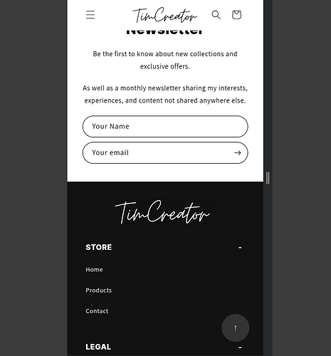
Hi, how can I stretch the containers so that they align with the end of the text? Starting at a screen width of 750px+, everything looks normal, so I just want to stretch them for widths up to 749px.
I want everything else to stay as it is—it works fine on mobile and PC—but when the screen size is around tablet dimensions, it looks off.
Here’s my store: https://1049xn-ya.myshopify.com/
(Just scroll all the way down to the email sign-up section.)
Thanks,
Tim
Hello @CreatorTim , Please follow these steps to add this CSS code:
- Go to your Online Store
- Click on “Themes”
- Select “Edit code”
- Open your CSS or Section file. If you have a custom CSS file, open that instead.
- If you can’t find your custom CSS file, open base.css" OR “theme.css”.
- Add or change to the existing code from the following code in the file.
#contact_form, #ContactFooter, #ContactFooter > .newsletter-form__field-wrapper, #contact_form > .newsletter-form__field-wrapper {
    /* max-width: 500px; */ /* remove or comment this CSS */
    max-width: 100%; /* add this CSS */
    width: 100%;
    display: flex;
}
Feel free to reach out if you have any questions or need assistance.
Best Regards,
DWS.
hey, it’s not working It only works up to a width of 549px, but that was already working before. I want it to work for widths up to 749px. How can I fix this.


