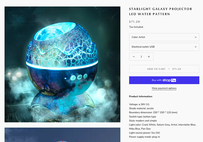
I have the Traffic not the sales in two months, HELP ME PLEASE< LOL

Hi Guys,

I need your help i have called and messaged the shopify customer service, I am broke I put a lot of money into advertising and I did get the traffic, NOT THE SALES, can you guys please help me, and don’t be mean, I am starting this from scratch. I have done everything the customer service said to do, I have watched youtube and did what they said. I am at a loss here, I cannot spend anymore money till istart making money.

I even rebuilt the store 3-4x any advice would be appreciated. Its a mind boggler… Thank you so much in advance.

Tracey aka spaceytraceys

Thank you so much, your awesome,

Hi, It says you don’t have that enabled, do you want me to put it here?

https://spaceytraceys.myshopify.com

hey yes its SpaceyTraceys@gmail.com

I sent it to you but its under SpaceyTraceys@gmail.com

I don’t know if you need the number its 6094673342

Hello @SpaceyTraceys ,

We are AliReviews - All-in-one reviews solution for all businesses.

Sorry to hear what you’ve been through. We dived into your site and notice a few thing you may want to change to create a better customers experience (don’t worry, you can adjust them by yourself and not cost any money).

1. Favicon:

Add favicon to your site so that people can recognize your store easier. You can add it by:

  1. Prepare your favicon image (can be your logo)

  2. Go to Online Store → Themes → Action → Edit Code → Assests → add a new assets.

  3. Upload your favicon image

  4. Open your theme’s “Layout” file (often called “theme.liquid”) and add the following code to the section:


2. Header section:

  • It’s great to see you make your header sticky, but it’d be better if you can add more content in it. Maybe: Search → Cart → Track Orders → Account .

  • Or, you can add menu in it: Home → Shop → About us → Contact.

Screen Shot 2023-02-22 at 10.45.21.png

  • The background images look not have high quality. Consider to use another image or you some tools to enhance the quality of the images.

  • The section with the red box in my screenshot should be set in the center of the background image and highlight it to make it more visible

3. Products section:

  • The images here are great, but it’d be more perfect if you can set them all in the same size and the products, the price align in the same rows together.

  • Add CTA button under each of your products to attract customers and increase the chance of Likelihood to purchase from your customers.

4. Testimonials:

Adding testimonials quite important since reviews are crucial when it comes to shopping online, people tend to buy the products that have many reviews (include good or bad, don’t make it looks too perfect, customers won’t believe it). You can use third-party apps to import reviews and design the visualization.

5. Products page:

  • Highlight the price or make it bigger to have a better visualization. Add a star rate next to it so that people can have a comparison and increase your brand trust.

  • Highlight your “add to cart” box to attract your customers and boost your sales.

Hope these can help. Please let us know if you need any further supports, we’d be happy to assist you. And it’d be nice of you to hit the Like Button or mark this as Accepted Solution for us, it encourage us a lot.

Regards,

AliReviews team

Hi Thank you so much but you are speaking greek to me, is there a tutorial
that i can watch them do all this/ How do you make the pricing bigger???
How do you make the add to cart better.?

It says my theme cant be changed and to be honest messing with any code im
too afraid to do unless i see someone else do it… This is where im at a
loss. So no one sees a MAJOR issue??? There has to be a reason not that the
squares dont match.. There are over 2000 on m y site and not one person
bought anything, i’m starting to get very frustrated… no one is telling
me the reason, except get a web designer and i cannot afford that.

Hello @SpaceyTraceys ,

Sorry for making you feel confused. To develop and increase sales is a long process, without financial and experience, you just have to try it from the little single one to improve it day by day.

Customer experience is one of big factors affect your sales funnel. With bad customers experience, people will likely to leave your site and refuse to make any purchase. Coding is difficult but with basic codes, you can try to fix it a little bit.

So, to change the size of your price texts, you can try to follow these steps:

  • Go to your Online store → Themes → Actions → Edit code → Assets
  • Find and click on the file that controls the styling of your product page. This is typically called “theme.scss.liquid” or “style.scss.liquid”.
  • Scroll down to find the section of the CSS that controls the price. This section will typically have a selector like “.price” or “.product-price”.
  • Modify the font-size property to change the size of the price. For example, you could change it to “font-size: 24px;” to make the price larger, or “font-size: 14px;” to make it smaller.
  • Save and preview

To make your “Add to cart” better, you can try to follow these suggestions:

1. Change the color: A simple way to make the “Add to Cart” button more visible is to change its color to something that stands out against the background. For example, if your store’s color scheme is primarily blue, you could change the button color to green or orange.

To change the color, you can modify the button’s CSS in your theme. Locate the button’s CSS selector (often “.btn” or “.product-form__cart-submit”) and add a “background-color” property with the color you want to use. For example, you could add:

background-color: #ff6600;

Note: the color I added here only for example, you can change it to the color you want

2. Increase the size: Another way to make the “Add to Cart” button more visible is to increase its size. This can help it stand out more on the page and make it easier to click.

To increase the size, you can modify the button’s CSS in your theme. Locate the button’s CSS selector and add a “font-size” property with a larger size. For example, you could add:

font-size: 18px;

3. Add a hover effect: Adding a hover effect to the “Add to Cart” button can make it more interactive and engaging for users. For example, you could change the button’s color or add an animation when the user hovers over it.

To add a hover effect, you can modify the button’s CSS in your theme. Locate the button’s CSS selector and add a “:hover” pseudo-class with the effect you want to use. For example, you could add:

background-color: #ff3300;

You can find more tutorial video on youtube, here’s one: https://youtu.be/JqtvmzHnO9I

Hope these can help you. Let us know if you have any further questions, we’d appreciate a lot if you could hit the Like button for us.

Regards,

AliReviews team.

1 Like

Hi @SpaceyTraceys

This is Richard Nguyen - CRO Expert from PageFly- Advanced Page Builder. I have a few comments to give and hope it would make your store better.

1. Change an eye-catching hero banner or slideshow banner

The first impression is very important but the current banner on the homepage isn’t attractive. You can use a short background video or an image that shows your products .

2. Add the “Highlight product" for homepage

It’s very common for the homewares store to show a highlight product on the homepage for boost sales and also make your customers know more about your store products.

3. Add the testimonial - customer reviews section

  • Customer reviews are proof of your product quality. This section will help you build customers’ trust. You can show rating stars for each product or you can add customer reviews as text and photos.
  • Reviews are crucial when it comes to shopping online. PageFly allows you to add testimonials and product review to the page in ease ways

4. Show the collection names on the menu header

Showing the collection name on the menu header can make it easier for your customers to find what they need and gain more sales.

5. Review and change the text color for your content

On some pages, your text color is similar with the background color so it’s very hard to scan your content.

You should review and change another color for them.

6. Have at least 3-5 product images for all products

  • Product images are essential elements for users to judge products- if products do not display enough images, users will not be able to get a full sense of products and will be reluctant to purchase.

Moreover, International Women’s Day 2023 (IWD) is just around the corner. With the theme #EmbraceEquality, here are some worthwhile ideas for you to make the most of it:

1. Personalize your discounts and deals

You can offer sales, discounts or special deals to your female customers to make them feel more valued in IWD!

2. Show testimonials from female customers

You can show rating stars for each product or you can add customer reviews as text and photos. Additionally, featuring women’s portraits with their testimonials would make it even more engaging.

3. Spotlights female staff

This can be a great way to enhance your brand presence as a brand that supports equality for women. You can even promote your own business if it’s women-owned as it is probably a golden opportunity for you to receive support and promotion from others.

I hope my recommendations will be beneficial for you. Have a nice day!