Hello, Shopify talents.
I really want to change the footer section to accordion style.
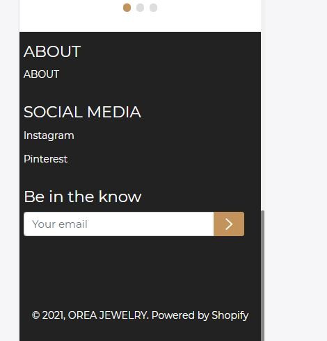
- Current
- My wish
I figured out this is called accordion style in bootstrap, and I’ve tried a number of times, but I failed to find a way how to link my custom css file to footer.liquid.
I’d really appreciate it if any of you give me any clue!
To achieve this you need a bit CSS and JS
Assuming that you have HTML like this
### About

- About

- Contact

### Social Media

- Instagram

- Pintarest
CSS
@media (max-width: 767px) {
  .link-list-wrapper-class {
    display: none;
  }
}
JS - need jQuery library
$(document).ready(function() {
  $('.heading-title-class').on('click', function() {
    if ($(window).width() < 768) {
      $(this).next().toggle();
    }
  });
});
Hello @Be_Steven ,
Do you know how I could implement your solution in this code?
Thank you
{%- if section.blocks.size > 0 -%}
{%- liquid
  if section.blocks.size == 9
    assign footer_grid_class = 'grid--3-col-tablet'
  elsif section.blocks.size > 6
    assign footer_grid_class = 'grid--4-col-desktop'
  elsif section.blocks.size > 4
    assign footer_grid_class = 'grid--3-col-tablet'
  endif
-%}

  {%- for block in section.blocks -%}


      {%- if block.settings.heading != blank -%}
        ## {{- block.settings.heading | escape -}}
      {%- endif -%}

      {%- case block.type -%}
        {%- when 'text' -%}

            {{ block.settings.subtext }}


        {%- when 'link_list' -%}
          {%- if block.settings.menu != blank and block.settings.heading != blank -%}

              {%- for link in block.settings.menu.links -%}
                - {{ link.title }}


              {%- endfor -%}


          {%- endif -%}
        {%- when 'image' -%}

            {%- if block.settings.image != blank -%}
              {%- assign image_size = block.settings.image_width | append: 'x' -%}

            {%- else -%}
              {{ 'image' | placeholder_svg_tag: 'placeholder-svg placeholder' }}
            {%- endif -%}


        {%- endcase -%}


  {%- endfor -%}

{%- endif -%}
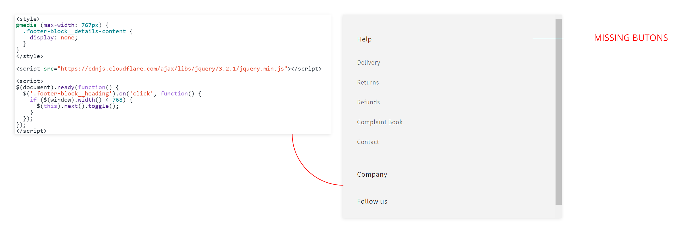
Hi King-Kang
for your case
CSS
@media (max-width: 767px) {
  .footer-block__details-content {
    display: none;
  }
}
JS, assumed your site already have jQuery
$(document).ready(function() {
  $('.footer-block__heading').on('click', function() {
    if ($(window).width() < 768) {
      $(this).next().toggle();
    }
  });
});
Cheers
Thank you very much for your kindness @Be_Steven ,
I will try that one.
Hello again @Be_Steven ,
Something happened 
Do you know how I can solve the missing buttons?
Thank you again
it’s quite simple, if you know CSS, you can change it easily, I have created a website mobile responsive, and with my dream color schemes, visit