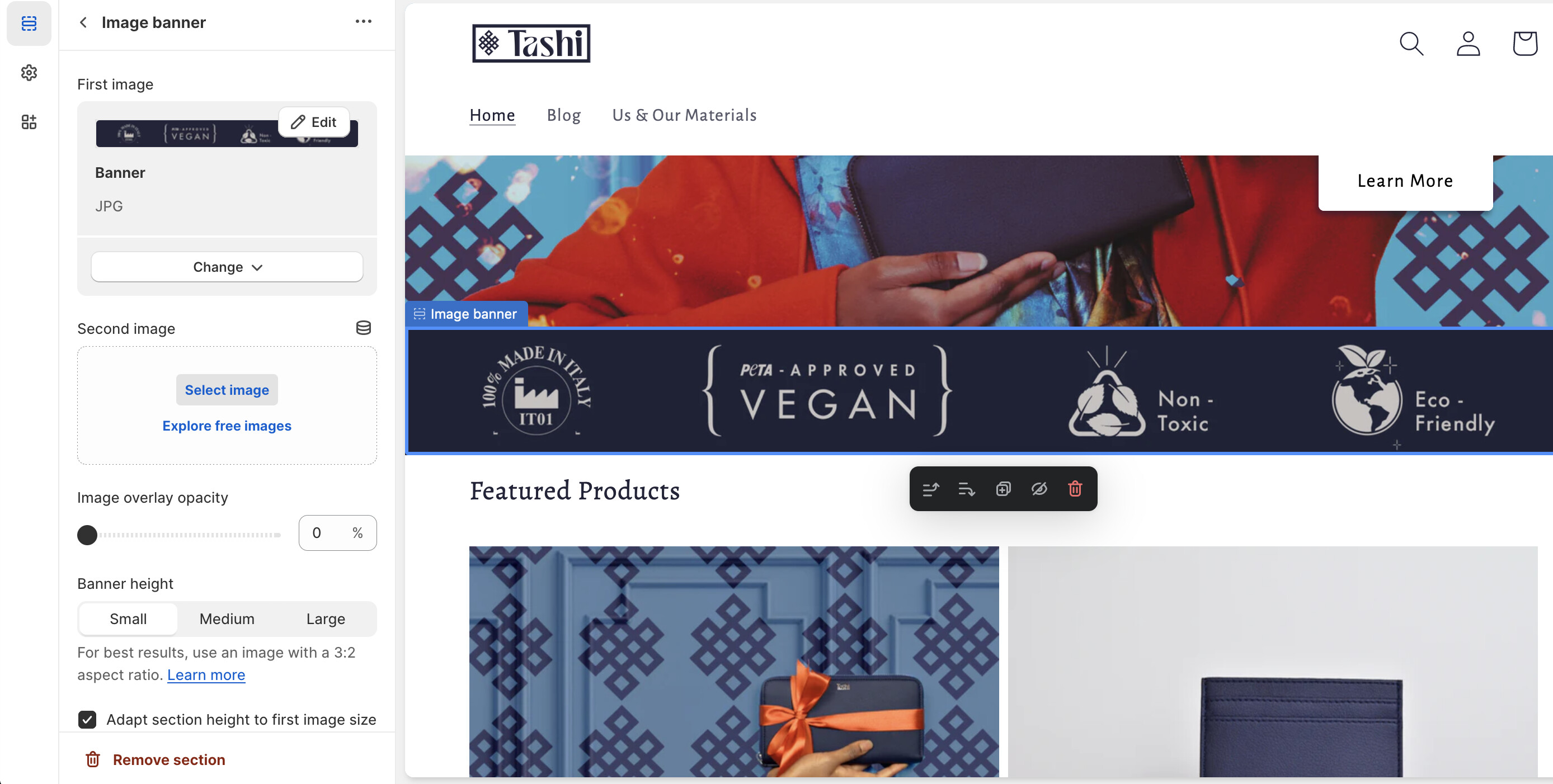
A user wants to reduce the height of a blue PETA logo banner on their Shopify store’s homepage (tashisarl.com), but only for desktop/laptop views—the banner appears too prominent and draws excessive attention.
Initial confusion: The user’s terminology mixed “width,” “thick,” and “thinner,” causing brief misunderstanding about whether they wanted horizontal or vertical adjustments.
Solution provided: Add custom CSS targeting the specific banner ID using a media query for screens 749px-1500px wide:
Set height: 70% (or adjustable percentage) on the banner container
Apply object-fit: fill to the image element
Code goes in the theme’s CSS file (base.css/style.css/theme.css)
Outcome: The solution successfully reduced the banner’s vertical height. The user adjusted the percentage to 80% for their preferred appearance.
Status: Resolved—the banner now displays less prominently on desktop while maintaining mobile formatting.
Summarized with AI on November 14.
AI used: claude-sonnet-4-5-20250929.
The image banner is a bit too thick. I would like draws so much more attention to it that I would like. But only on the computer/laptop version. Can I edit the laptop/computer version only to make it thinner? How can I fix it. screenshots attached.
I’m not sure I understand what you mean (we’re talking about the blue banner with PETA logo right?). You say it’s too thick but you want to draw much more attention to it?
rom your Shopify admin dashboard, click on “Online Store” and then “Themes”.
Find the theme that you want to edit and click on “Actions” and then “Edit code”.
In the “Assets” folder, click on “base.css, style.css or theme.css” file, depending on which file your theme uses to store its CSS styles. At the bottom of the file, add the following CSS code:
@media only screen and (min-width: 749px){
div#Banner-template--14923215798320__4e3db4e3-86d3-4e98-accd-dbeb8fce8d34 {
    width: 90%;
    margin: auto;
}
}
And save.
Note: You can also decrease/increase the size of the width.
Please don’t forget to Like and Mark Solution to the post that helped you. Thanks!

