Hello, I’m hoping someone might be able to help me with please, I have tried searching the community but cant find anything similar.
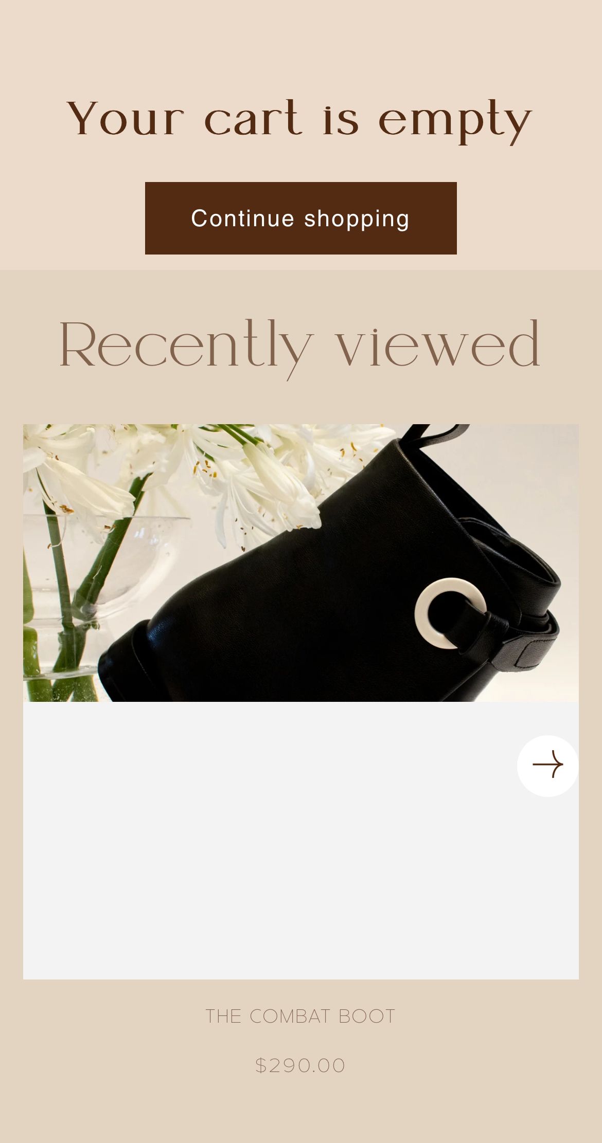
In the Recently Viewed section of my cart, the images all look fine on desktop and the mobile view of customisation, but when i open the site on my iphone, the image is cut in half with white space.
https://eserdiv.com/
Thank you in advance.
Hi @eserdiv ,
You can try this code by following these steps:
Step 1: Go to Shopify Admin → Online Store ->Theme → Edit code
Step 2: Search file base.css, theme.css or styles.css
Step 3: Insert the below code at the bottom of the file → Save
@media (max-width: 600px) {
  .card__media .media.media--transparent {
    padding-bottom: 0 !important;
  }
}
Here is result:
Hope this can help you,
If our suggestions are useful, please let us know by giving it a like or marking it as a solution. Thank you 
1 Like
Thank you so much! It worked! Appreciate you
1 Like