Can anybody please help me create an image slider for multiple product images, but I don’t want to display the thumbnail? Thank you!
Link: https://2cb7cc-ab.myshopify.com/
Pass: Minitrampoline
Can anybody please help me create an image slider for multiple product images, but I don’t want to display the thumbnail? Thank you!
Link: https://2cb7cc-ab.myshopify.com/
Pass: Minitrampoline
where you want to add the slider? on home page or on product page?
On the product page for all the product images
Hi @NgocLe1 , You can follow my instructions!
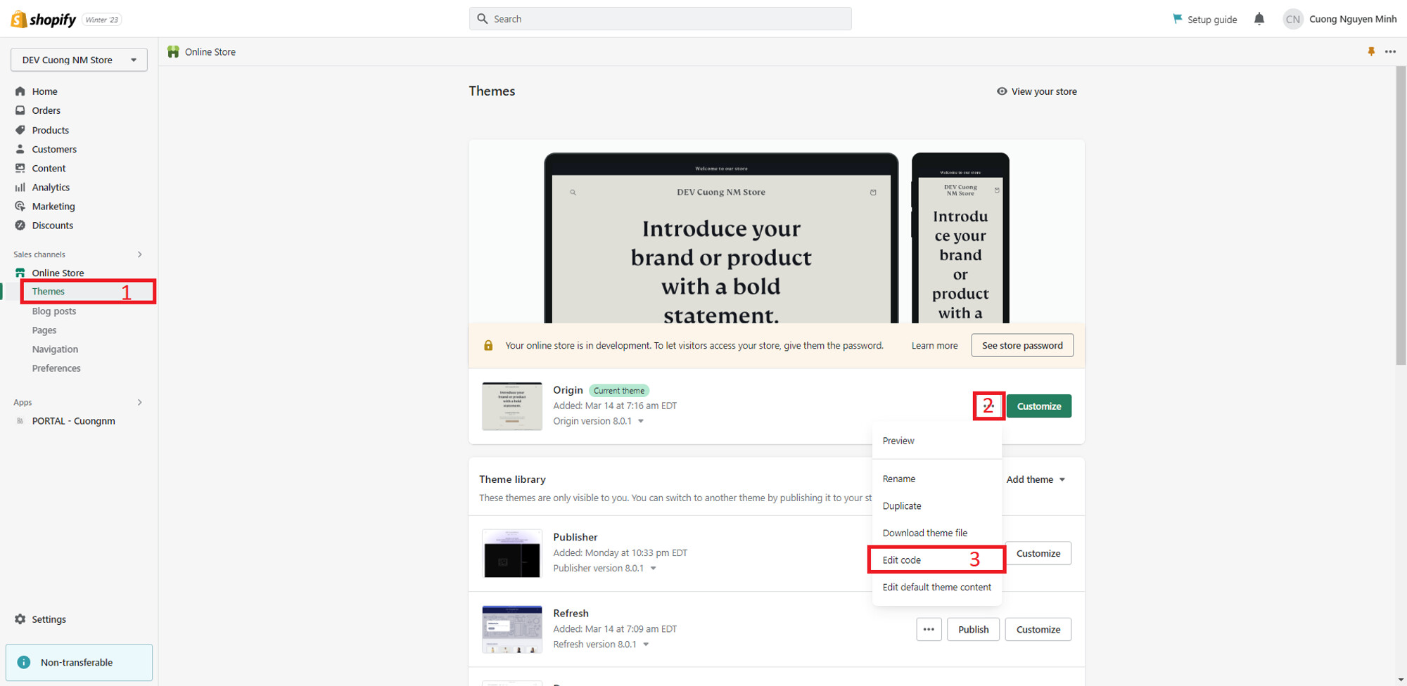
Go to Themes → Edit Code.
Find the file theme.liquid. Add the following CSS snippet before the closing head tag ()
It will look like this
@media screen and (min-width: 750px) {
  [id^="Slider-"].product__media-list {
    display: flex !important;
    overflow-x: auto;
    width: 100% !important;
  }
  [id^="Slider-"].product__media-list  > li {
    width: 100%;
  }
  [id^="GalleryThumbnails-"] {
    display: none !important;
  }
  .slider--mobile+.slider-buttons {
    display: flex !important;
  }
}
The achieved result
I hope these instructions will help you. If they are helpful, don’t forget to like and mark as the solution.
Hi @NgocLe1 , You can try to follow my instructions.
Go to Themes → Edit Code.
Find the file theme.liquid. Add the following CSS snippet before the closing head tag ()
It will look like this
@media screen and (min-width: 750px) {
  [id^="Slider-"].product__media-list {
    display: flex !important;
    overflow-x: auto;
    width: 100% !important;
  }
  [id^="Slider-"].product__media-list  > li {
    width: 100%;
  }
  [id^="GalleryThumbnails-"] {
    display: none !important;
  }
  .slider--mobile+.slider-buttons {
    display: flex !important;
  }
}
The achieved result
I hope these instructions will help you. If they are helpful, don’t forget to like and mark as the solution.
Hi @NgocLe1 , You can try to follow my instructions.
Go to Themes → Edit Code.
Find the file theme.liquid. Add the following CSS snippet before the closing head tag ()
It will look like this
@media screen and (min-width: 750px) {
  [id^="Slider-"].product__media-list {
    display: flex !important;
    overflow-x: auto;
    width: 100% !important;
  }
  [id^="Slider-"].product__media-list  > li {
    width: 100%;
  }
  [id^="GalleryThumbnails-"] {
    display: none !important;
  }
  .slider--mobile+.slider-buttons {
    display: flex !important;
  }
}
The achieved result
I hope these instructions will help you. If they are helpful, don’t forget to like and mark as the solution.
Hi @NgocLe1 , you can follow my instruction
Go to Themes → Edit Code.
Find the file theme.liquid. Add the following CSS snippet before the closing head tag ()
It will look like this
@media screen and (min-width: 750px) {
  [id^="Slider-"].product__media-list {
    display: flex !important;
    overflow-x: auto;
    width: 100% !important;
  }
  [id^="Slider-"].product__media-list  > li {
    width: 100%;
  }
  [id^="GalleryThumbnails-"] {
    display: none !important;
  }
  .slider--mobile+.slider-buttons {
    display: flex !important;
  }
}
The achieved result
If you find it useful, please give us a like and mark it as a solution. Thank ^^