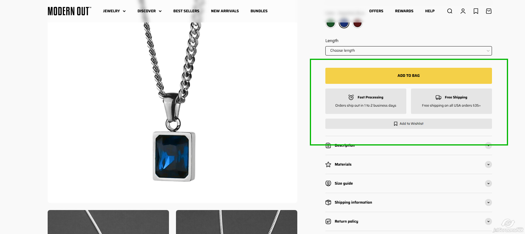
I am curious if anyone is familiar with the Impact theme. It doesn’t allow you to change the top and bottom margins of its block sections within the theme easily. I was wondering if anyone knew a hack to make around the button areas (red arrows) more cohesive like the green arrow. It’s messing with my ocd. Thank you.

Hey @modernout,
Could you please share your store URL along with password [if applicable] so that I can take a look and provide you with the solution code.
Waiting to hear back from you.
Thanks
My url is modernout.com or modernout.Myshopify.com
@modernout Can you please share this page link?
Hi @modernout ,
Go to Online Store > Themes > Actions > Edit Code > theme.css
Add below code at the bottom of theme.css file
.product-info__block-item[data-block-id="buy_buttons"] {
    margin-bottom: 1rem;
}
body .product-info__block-group.product-info__offer-list {
    margin: 0;
}
.product-info__block-item[data-block-id="AWEZVMHR6UWhHT0dib__swish_formerly_wishlist_king_wishlist_button_block_WrBrF6-1"] {
    margin-top: 1rem;
}
Hello @modernout
Go to Online Store > Themes > Actions > Edit Code > Assets > base.css
Paste your CSS at the bottom of base.css and click Save
.product-info__block-item[data-block-id="buy_buttons"] {
    margin-bottom: 1rem;
}
body .product-info__block-group.product-info__offer-list {
    margin: 0;
}
.product-info__block-item[data-block-id="AWEZVMHR6UWhHT0dib__swish_formerly_wishlist_king_wishlist_button_block_WrBrF6-1"] {
    margin-top: 1rem;
}
Frankly, I don’t see why that space bothers you. It allows the Add to Cart button to stand apart from other notification boxes. Your theme includes several block options below the yellow button with “auto” spacing, so if you edit the button margin, you may end up chasing your tail when you customize the page in the future.
1 Like