I’m using Archetype Impulse theme. In product page settings you can display the Size / Color variations as either Swatches or Dropdown.
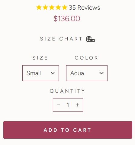
Is there a way to show Swatches for Variants on Desktop and Dropdown for Variants for mobile?
(Desktop image below)
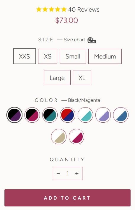
(Mobile image below)
Alternatively, if the above isn’t easy or possible, we’d prefer to use the swatches for both mobile and desktop.
If we go this route, is there a way to make all the swatches appear in 1 row, so it’s neater
(This is how it currently looks)
Thanks for your help
Hi @Winston77
This requires modifications to the theme code and cannot be resolved by simply adding CSS. A more in-depth adjustment is needed to properly implement the changes.
I would recommend that they hire a professional developer to handle this, as it involves coding expertise beyond basic styling adjustments. Investing in a skilled developer will ensure the changes are implemented correctly and efficiently.
Best,
Daisy
Hi @Winston77
You can try Easify Product Options! It lets you use swatches for both desktop and mobile and customize the display for a cleaner look, all without coding! This app lets you customize product options in various ways—here’s an example that I think would work well for your store:
This app is straightforward, and I believe it will work well for you. Reach out to Easify if you need any assistance!