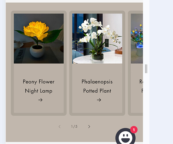
I’m experiencing an issue with the mobile version of my carousel on Trade Theme. I have a product slider where each product should take up 100% of the screen width, but on mobile, the second product is partially visible while the first product is in view. How can I make each slide in the carousel take up 100% width on mobile without showing part of the next product?
Topic summary
A user is troubleshooting a mobile carousel layout issue in Shopify’s Trade Theme where product slides don’t occupy full screen width—the second product appears partially visible alongside the first.
Problem Details:
- Product slider should display one item at 100% width on mobile
- Currently shows preview of next product while viewing current slide
- Screenshots demonstrate the unwanted partial visibility
- Live site: splendas.com
Proposed Solutions:
- One commenter suggests this may be intentional UX design to indicate swipe functionality, though navigation arrows exist
- Another user offers to discuss width calculations and overflow settings but doesn’t provide specifics
Working Solution Provided:
A CSS fix targeting mobile viewports (max-width: 989px) that:
- Removes scroll padding
- Sets slide width to 100%
- Optionally adds padding around the carousel for spacing
Code snippets with before/after screenshots were shared for implementation in the section’s Custom CSS settings. The original poster has not yet confirmed whether this solution resolved the issue.
It need to be aligned from the media section
Would you mind few help?
hey @SPdas
It sounds like your carousel’s width calculation or overflow settings are causing the issue. Here’s how you can fix it in your Trade Theme on Shopify
are you open to more discussion?
@SPdas , consider looking at this from another point of view: this is done intentionally to hint that this element is a carousel and that it can be swiped left and right.
I see no arrows or dots – usual signs that element is a carousel…
Tim, an arrow is cropped. Please take a look at this website URL https://splendas.com/
I attempted to apply the provided code to both the feature collection CSS and base.CSS, but unfortunately, it didn’t work. I couldn’t locate the carousel setting the only available option is to turn it on or off. Please see the image below for your review and you can also check the following URL: https://splendas.com/.
No, I did it myself. if you have a solution please let me know.
In this case paste this into “Custom CSS” setting of this section:
@media screen and (max-width: 989px) {
  .collection .slider.product-grid {
    scroll-padding-left: 0;
  }

  .collection .slider li {
    width: 100%;
  }
}
Will stretch your slide to full-bleed on mobile:
If you want some space around, add something like:
.collection {
  padding-left: 1rem;
  padding-right: 1rem;
}


