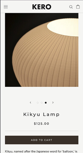
On mobile devices, the product images take up 100% of the width of the screen. I want it to have some padding around the images so the image would be like 80% the width of the screen. My store is https://mk0uuf-h3.myshopify.com/products/balloon-lamp
Topic summary
A Shopify store owner using the Prestige theme wants to reduce product image width on mobile devices from 100% to approximately 80% of screen width, with padding around the images.
Three CSS solutions were proposed:
-
BiDeal-Discount’s approach: Targets screens under 1007px, sets
.Product__Galleryto 80% max-width with auto margins -
Moeed’s method: Adds custom CSS via theme.liquid file above the
</body>tag (specific code not fully visible in post) -
Dan-From-Ryviu’s solution: Applies 24px horizontal padding to
.Product__Galleryon screens under 749px via Theme Customizer’s Custom CSS section
All solutions use media queries to target mobile viewports specifically. The discussion remains open with no confirmed resolution from the original poster regarding which approach worked best.
Hi @Jarch2
let try to add this Custom CSS:
@media screen and (max-width: 1007px) {
  .Product__Wrapper .Product__Gallery {
    max-width: 80%;
    margin-inline: auto;
  }
}
Hey @Jarch2
Follow these Steps:
-
Go to Online Store
-
Edit Code
-
Find theme.liquid file
-
Add the following code in the bottom of the file above tag
RESULT
If I managed to solve your problem then, don’t forget to Like it and Mark it as Solution!
Best Regards,
Moeed
Hi @Jarch2
You can add this code to Custom CSS in Online Store > Themes > Customize > Theme settings to do that.
@media (max-width: 749px) {
.Product__Gallery { padding: 0 24px !important; }
}

