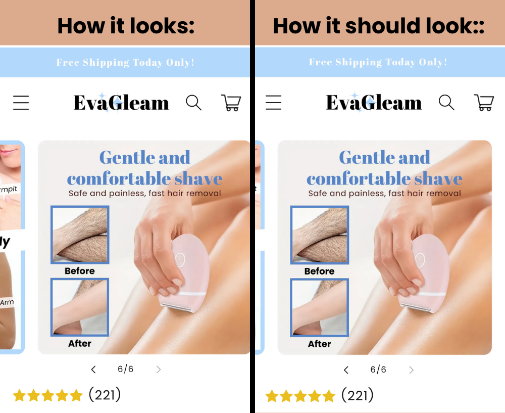
I am using a Shrine theme for my Shopify store and for some reason, on the last photo on the product page, the spacing appears to be off (the image is not centered). This is only on mobile view, and on desktop, it seems to be fine. Can anyone help me with this?
As you can see, the product photo should be centered with the page, and have some spacing on the right side of the photo, rather than ending at the end of the screen like it currently does.
No, the issue is still there. it’s fine if you are expecting it on desktop and inside Shopify, however, when I view the store on my phone, it is not. For example here is a photo of the product page on mobile view inside the Shopify page editor (it looks fine, but it is not if I view it on my phone):
Everything looks fine in Chrome browser. Which browser and phone are you using?
If you don’t want to see other sliders on the left and right sides of the desired screen, this can be done. In other words, only a single slider will be fully visible.
In Google Chrome, there’s a portion of the second slider visible on the right side of each slider. I couldn’t test it in Safari browser. So basically, you want to center all sliders on the screen, right?
I see! There seems to be an issue with different devices. For example, it works smoothly on Samsung phones, but it’s problematic on iPhones. The code I provided was intended to be a simple solution. Typically, slider areas often require intervention with JavaScript codes as well. Would you mind trying the code below after removing the ones I previously provided? If it doesn’t work, we can try other solutions. Currently, here’s how the display looks on the virtual iPhone 14 Pro Max in Chrome.