Hi,
I am using the luxe theme. website www.clkequestrian.com.au
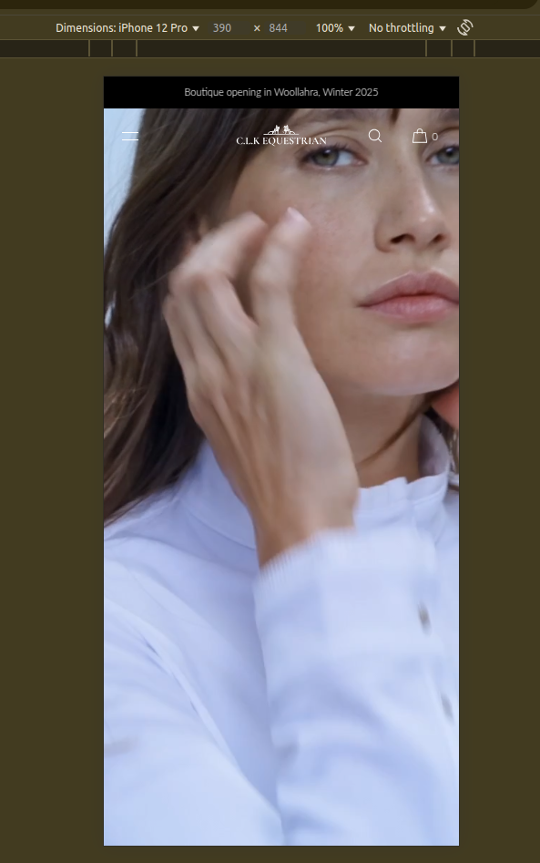
I have a video which looks great on desktop but so small on mobile. I know I need to edit the code but would appreciate guidance.
I’d like the video to be 9.16 full screen ration on mobile.
Any help would be appreciated.
Hi @fairbear95
I am from Mageplaza - Shopify solution expert.
Please open the base.css file, then add the following code at the end of the file.
@media only screen and (max-width: 767px) {
  #shopify-section-template--19213287653626__video_CWmEjN .video-player-sh video {
    height: 100% !important;
  }

  #shopify-section-template--19213287653626__video_CWmEjN .video-player-sh {
    height: 100% !important;
  }
  .fullscreen{
    height: 100vh;
  }
}
*Result:
Please let me know if it works as expected!
Best regards!
1 Like
Thank you so much! You’re amazing. I really appreciate your help.
1 Like