canoa
August 26, 2024, 10:37am
1
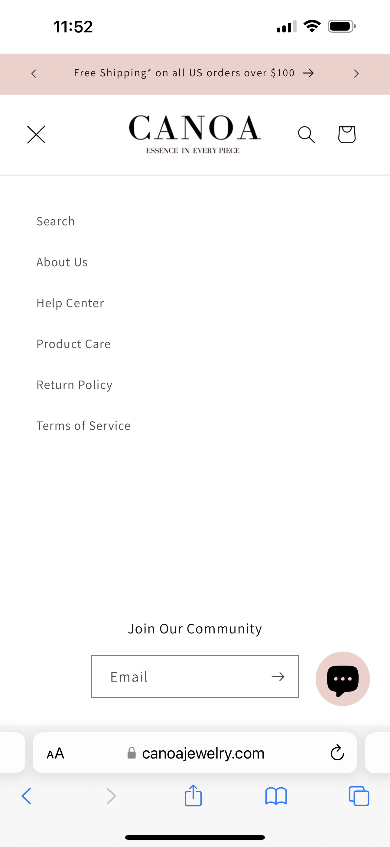
Hi,
The main menu drawer does not open on mobile, it shows an X when clicked but no menu:
I tried editing the code like the below link suggested but it added the footer instead of the main menu
https://community.shopify.com/c/shopify-design/shopify-mobile-menu-not-functioning-correctly/m-p/2584735
Really appreciate any help with this.
My site is https://canoajewelry.com/
Thank you!!
1 Like
tim_1
August 26, 2024, 11:54am
2
You have couple of problems in your assets/base.css:
@media screen and (max-width: 556px) {
section-template--18388375732502__custom_liquid_ghempA-padding img,
section-template--18388375732502__custom_liquid_4zpMha-padding img,
section-template--18388375732502__custom_liquid_KfybXr-padding img,
{
  max-width: 100% !important;
  margin: 0 auto !important;

}

body,html,*{
  overflow-x: hidden !important;
}
}
this should not be there;
This code prevents you from seeing the mobile menu:
body,html,*{
  overflow-x: hidden !important;
}
I believe the main culprit is the * in the selector.
Finally, since the first part of the code applies only to a particular sections it is much better to put it (modified of course) into Custom CSS setting of that theme.
Hi @canoa , Pls remove this in file your base.css:
Hope this can help you,
If our suggestions are useful, please let us know by giving it a like or marking it as a solution. Thank you

