Make banner larger in height so it covers the whole homepage, just like the desktop version. Thanks!


Hi @MiguelMaya
To change the height of the banner on mobile, follow these steps
Step 1. Go to Admin → Online store → Theme > Edit code
Step 2. Find the file section-iamge-banner.css. Search for the following CSS snippet
@media screen and (max-width: 749px) {
    .banner--large:not(.banner--mobile-bottom):not(.banner--adapt) .banner__content {
        min-height: 39rem;
    }
}
The number 39rem is currently limiting the maximum height that the banner can achieve. Please change it to a different number; here, I’ve chosen the number 67rem.
@media screen and (max-width: 749px) {
    .banner--large:not(.banner--mobile-bottom):not(.banner--adapt) .banner__content {
        min-height: 67rem;
    }
}
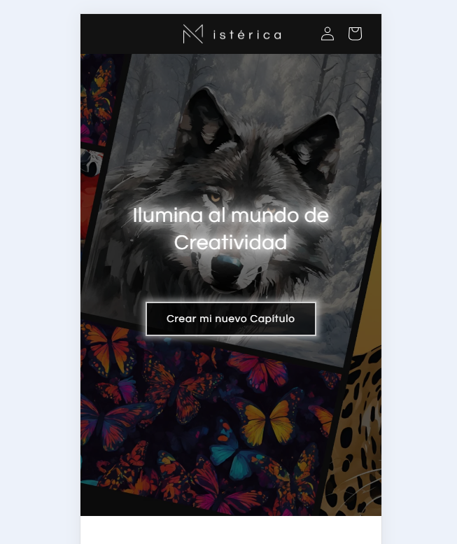
Result

Then the issue of the text moving up will disappear.
If it helps you, please like and mark it as the solution.
Best Regards
1 Like
looks neat. Can i add more space between the title and the button, still staying centered? Thanks!
Hi @MiguelMaya
Of course. Still in the file section-image-banner.css and add this code snippet to the end of the file
@media screen and (max-width: 750px) {
  .banner__heading {
    transform: translateY(-45px);
  }
}
Result
Change the number -45 to see the difference.
If it’s helpful, please like and mark it as a solution, thank you