Hello,
I have been seeing this hamburger menu design a lot lately for Shopify mobile and I would like to add this to a site I am customizing for a client. This is the desired result:
Thank you!
Hello,
I have been seeing this hamburger menu design a lot lately for Shopify mobile and I would like to add this to a site I am customizing for a client. This is the desired result:
Thank you!
hey @arahming123 share the URLs of your website plz
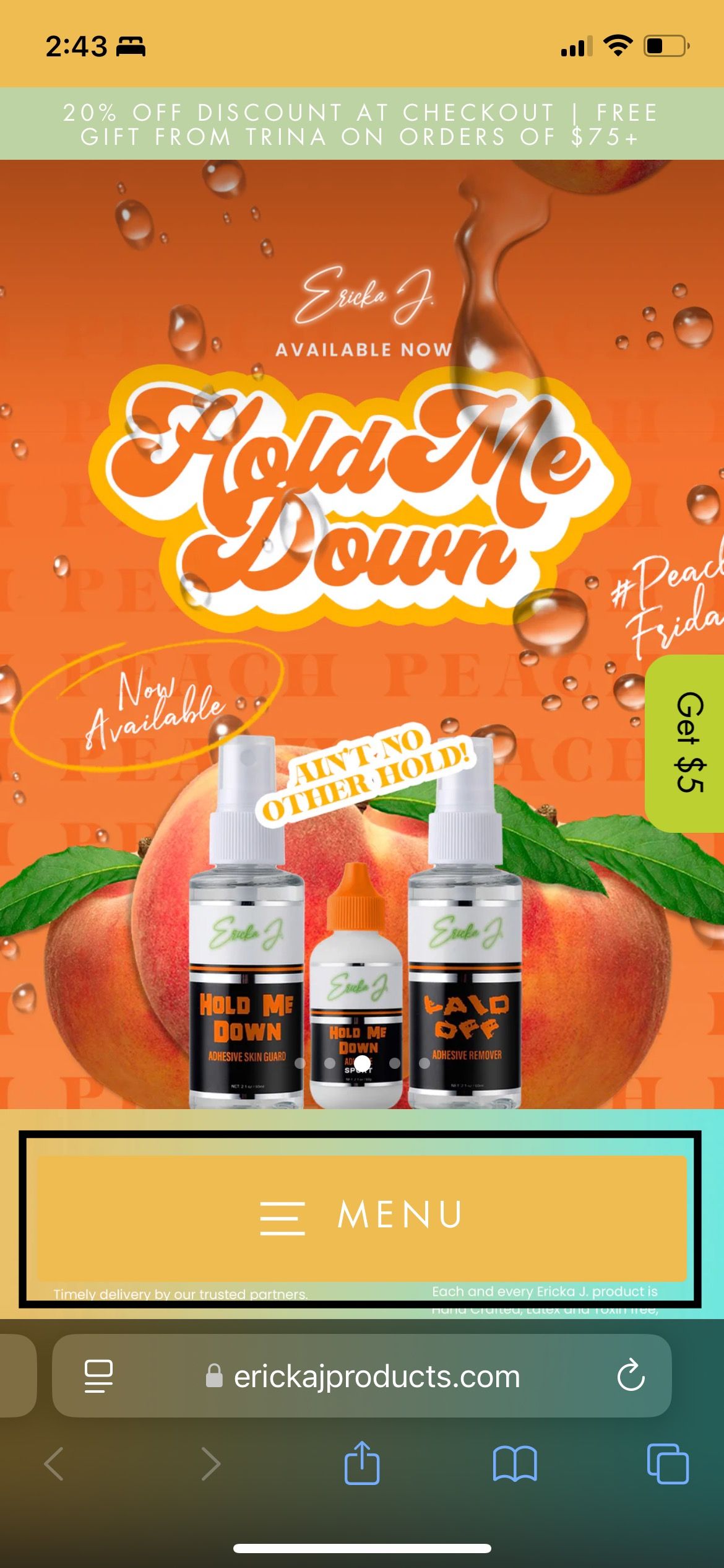
hello,
The website is not published at the moment
@media screen and (max-width: 767px) {
button.btn.site-nav__thumb-button.js-toggle-slide-nav {
    position: static !important;
 }
}
hey @arahming123 follow the following steps plz
Go to online store ----> themes ----> go to three Dots ----> edit code ---->find theme.liquid files ----> place the code ---->
under the tag before the body ----->
if this code work please do not forget to like and mark it solution
try again plz with this one
Hi @arahming123 ,
It will be a complicated request and involve many steps, I recommend you hire a professional for it.
If just display, you can refer to the following code. Please go to Actions > Edit code > Assets > base.css file and paste this at the bottom of the file:
@media screen and (max-width: 989px) {
    header-drawer {
        position: fixed;
        bottom: 2rem;
        z-index: 999;
        background: #ffffff;
        width: 80%;
        border-radius: 20px;
        left: 50%;
        transform: translateX(-50%);
    }
.menu-drawer-container {
    width: 100%;
    justify-content: center;
}
}


