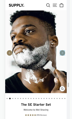
Hello, I would like to make the product image bigger on the mobile format only.
This is how it currently looks:
This is how I would like it to look:
This is my website: https://lovelmexico.com/products/depilador-nuva-skin
Thank you very much for your help!
Hi @jtorres
I’m Richard Nguyen - CRO Expert at PageFly, I’d like to suggest this idea:
it looks like your photo is at 342x342 size, please try with a larger size
Hope you find my answer helpful!
Regards,
Richard-pagefly
@jtorres
Follow this way to correct your issue:
- Open file Theme editor > assets > theme.css
- Add this code at the bottom of the file
@media screen and (max-width: 999px) {
	.product.product--thumbnails-left flickity-carousel .product__media-item {
	    padding-left: 0 !important;
	    padding-right: 0 !important;
	}
}
try it and let me know
1 Like
@ExpertRookie It worked perfectly, thank you so much.
There is only one small problem, there is a white space on top, between the header and image
How could I fix this?
Hi @jtorres
Add this code
@media screen and (max-width: 740px) {
  .product:not(.product--featured) {
    margin-top: 0 !important;
  }
}
1 Like
Thank you so much, it worked perfectly!
Hello @ExpertRookie would this solution work on Dawn theme as well? This is my store url: https://onyn2drfmq5grb84-26499285045.shopifypreview.com
I also created a similar thread, but never received any guidance, hoping you can help me on this! Thanks


