I was looking for a clean, easy way to add a Masonry Image gallery.
I put together this Image Gallery section, which is really simple and works well for a simple, basic, responsive Masonry Image Gallery.
To add this section
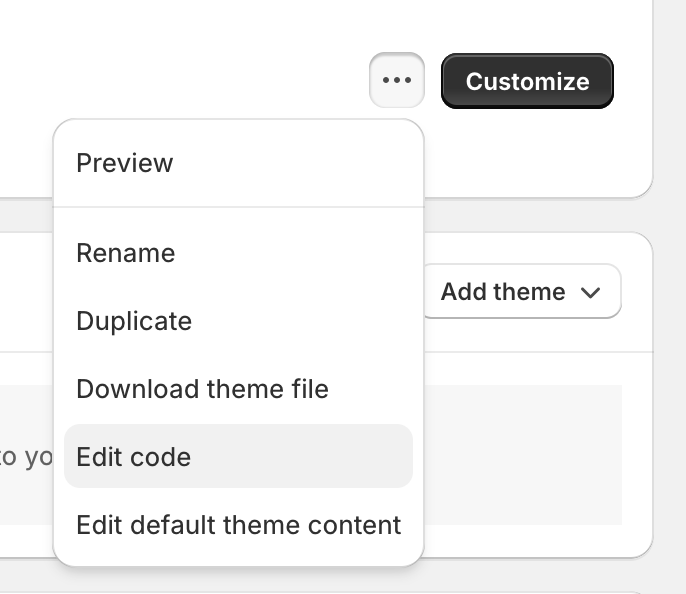
- Go to Online Store → go to the three dots to the left of Customize and click Edit Code
- Sections → Add a new section
- Make sure liquid is checked, name it image-gallery.liquid
- Copy/paste the liquid code below
- Done, “Image Gallery” should now show up when you edit a page and click “Add section”
Screenshot of what it looks like

{%- if section.blocks -%}

<style>
  .image-gallery-wrapper {
    columns: 300px;
  }

  .image-gallery-wrapper .image-gallery-item img {
    width: 100%;
    margin-bottom: 1rem;
  }
</style>

  <section class="image-gallery">
  <div class="page-width">

  {%- if section.settings.custom_text_title -%}
    <h2 class="h1">{{ section.settings.custom_text_title }}</h2>
  {%- endif -%}

    <div class="image-gallery-wrapper">

      {% for blocks in section.blocks %}
        <div class="image-gallery-item">
          <img src="{{ blocks.settings.gallery_image | img_url: 'large' }}" alt="{{ section.settings.custom_text_title }} gallery image">
        </div>
      {% endfor %}

    </div>

  </div>
</section>

{%- endif -%}

{% schema %}
  {
    "name": "Image Gallery",
    "disabled_on": {
      "groups": ["header", "footer"]
    },
    "settings": [
      {
        "id": "custom_text_title",
        "type": "text",
        "label": "Text box heading",
        "default": "Gallery Title"
      },
    ],
    "blocks": [
      {
        "name": "Gallery Image",
        "type": "gallery_image",
        "settings": [
          {
            "type": "image_picker",
            "id": "gallery_image",
            "label": "gallery image"
          }
        ]
      }
    ],
    "presets": [
    {
    "name": "Image Gallery",
    "category": "Image Gallery"
    }
    ]
  }
{% endschema %}
It’s purposefully very simple. No links, lightboxes or any fancy code.
A good baseline to customize if you want, but it should just work following the simple instructions above.
CSS customizations
3 lines of CSS control the masonry layout and it’s responsive without breakpoints! (it’s magic! using the voodoo of css columns)
You can play with the columns: 300px; width to adjust column widths
If you want to adjust the horizontal spacing, add
column-gap: 30px;
to .image-gallery-wrapper and adjust as needed. You’ll want the column-gap and img margin-bottom to match for consistent horizontal and vertical spacing within the masonry layout if you adjust it
The img margin-bottom value controls the vertical spacing