Hello Everyone!
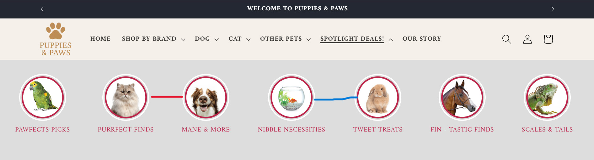
I am using Shopify Dawn Theme. I have added images to the mega menu through coding.
- I want to keep the images in one line in desktop mode. It is fine in mobile mode.
- I want to keep the text below the image in one line. It is showing 2 lines.
- I want to reduce the space between the image and the text a little in desktop and mobile mode.
I have added the image below.
Store: https://dream-candle-lights.myshopify.com/
Password: Admin
I want to keep it exactly like this image.
Hi @dreamtechzone_5
let try to add this custom css code:
@media (min-width: 768px) {
  #Details-HeaderMenu-6 .mega-menu__list {
    flex-wrap: nowrap;
  }
  #Details-HeaderMenu-6 .mega-menu__list > li {
    flex: 0 0 max-content;
  }
}
#Details-HeaderMenu-6 .mega_menu_img .title {
  height: auto;
  margin-top: 10px;
  width: auto;
  border-radius: unset;
}
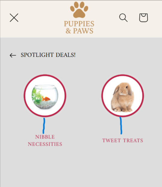
the result will look like:
1 Like
Great it worked. But I want to increase the space between images. The images stick to each other. And I want to keep the same space between each image. Thank you very much.
let replace with this css:
@media (min-width: 768px) {
  #Details-HeaderMenu-6 .mega-menu__list {
    flex-wrap: nowrap;
  }
  #Details-HeaderMenu-6 .mega-menu__list > li {
    flex: 0 0 140px;
  }
}
#Details-HeaderMenu-6 .mega_menu_img .title {
  height: auto;
  margin-top: 10px;
  width: auto;
  border-radius: unset;
}
The space in the image doesn’t seem to be the same.
Can the text be small and bold in desktop mode?
And in mobile mode, there seems to be more space between the image and the text.
ok let replace with this css:
@media (min-width: 768px) {
  #Details-HeaderMenu-6 .mega-menu__list {
    flex-wrap: nowrap;
  }
  #Details-HeaderMenu-6 .mega-menu__list > li {
    flex: 0 0 140px;
  }
}
#Details-HeaderMenu-6 .mega_menu_img .title {
  height: auto;
  margin-top: 30px;
  width: auto;
  border-radius: unset;
  font-size: 1.17rem;
  font-weight: bold;
}
1 Like